Typophile

Not Another Freelance Designer Logo!

Ed Aranda

Some of you may have seen my post a while back about a logo for my freelance work. I was going to use the name "Red Door Design" until it came to my attention that there are a handful of existing agencies with the same name.

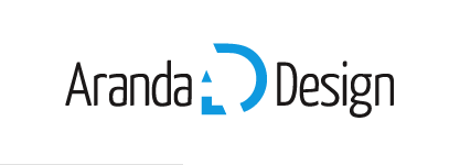
So I decided to use my last name instead — "Aranda Design" — and developed a logo. Interested to hear anything that anyone has to say.
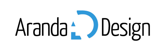

I'm not loving the way the A makes the ends of the D curve. Would be better as a straight line I think.

I was hoping someone would say something about that. My initial design used straight lines, but I thought it needed to tie a little bit better to the typeface of "Aranda Design". Though it seems I didn't quite hit it on the head. I'll post the other version later.

i agreed with picard, the curves at the end and beginning of the D does not help to see the A. it took me a while to see the A, i saw the pencil and didn't look further first - now i cannot not seeing it anymore. I'm not sure about your choice of typo, sure the style make it somehow personal designer but there is maybe too much difference about the A of the typo and the A of the logo.
That said about details, IMO your mark is great.

It took me a while to see the A, probably because it's bolder than the D, unless it is just an optical trick.

Thanks for the feedback. You guys are echoing exactly some of the things I was thinking myself. I just needed to see if I was over-thinking.

Yes, the A is bolder than the D. That was the only way I could make all three “levels” work. I think if I ditch the curves at the ends of the D, the A should be more apparent. I rather like the typeface, but I see what you mean about the A's not being similar enough. The letters in the mark are based on Gill Sans. Maybe I should try that for the type.

Two more variations ...

i think the two are working, but i prefer the second, much much more Classy and pro, and the reference to the A is immediate.

Yep, A is kind of hard to see, and without seeing it the mark looks kind of busy, because of the element count. Secondly, the mark has too much whitespace; basically the positive parts are way too thin and neg/pos balance is not there. Also, the concept is interesting, the bent pencil looks quite a bit unconventional and geometrically forced. Lastly, placing the mark between the words is not working for me personally. All in all, the mark has a lot of promise, but needs more tinkering with.

Hmm, looks like I have some work to do. I'll get back to you guys when I find some time to revise. Thanks for the comments.

slash...D

I see what you're trying to do - but as eps has said ... it's not really reading/working at the moment.

----------
Paul Ducco
Graphic Designer - Melbourne

Oh well, I think this one's going in the trash. Doesn't seem like people are picking up on it the way I thought they would. And I don't really see any apparent way to make it read any better.

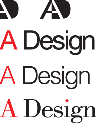
Just a thought to share. Have you considered alternate names? Simplification is sometimes a great way to create impact and a clever name. I would consider using just your initial “A” and the word “Design” in a classic font like Helvetica or Bodoni. Maybe the A in red and Design in Black or Grey. It could be a nice play on your name and a statement of precisely what you do ... A Design.

James Tocco
Designer, Detroit, Michigan USA

Something like this perhaps.

James Tocco
Designer, Detroit, Michigan USA

Ed, have you considered using a heavier weight for the D? I think the A just needs more to knock out of. You're right that it's not working, but I think it may simply not be working *yet*. Also, I strongly recommend not flanking the mark with type. It's too noisy and disruptive to the flow. Also, I think the mark needs room to read, as it is trying to use angular relationships to create an implied formal relationship.

Don't give up!

First, let me just thank you guys for taking the time to really look at this stuff and give constructive feedback. Since I joined this forum, everyone has been nothing short of a class act, and that's something rare and worth appreciating on the internet.

That said, I think I will continue to develop this idea and implement some of your suggestions. Look for some new comps over the weekend, as I have my hands and brain full with my eight-to-five until then.

I haven't gotten a chance to get back into this one yet, but I explored some other ideas and wanted to post them up here for comparison.

Captured from web.archive.org on 14 Oct 2013. view this capture