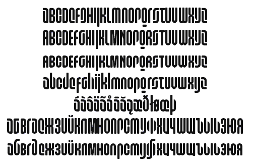
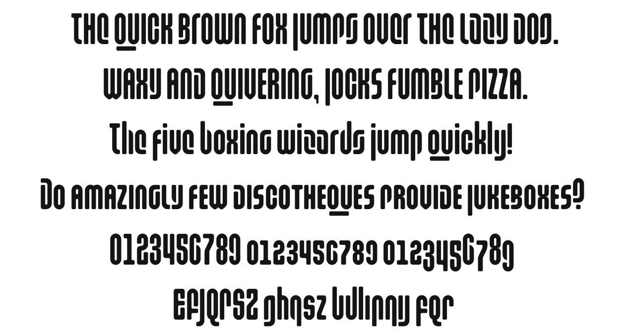
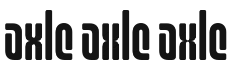
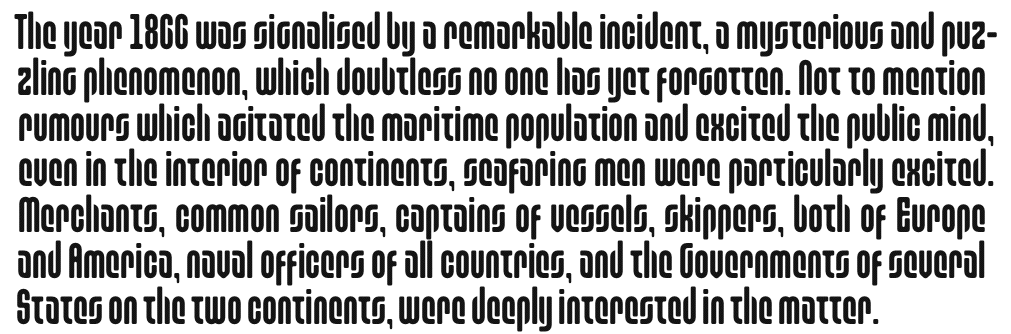
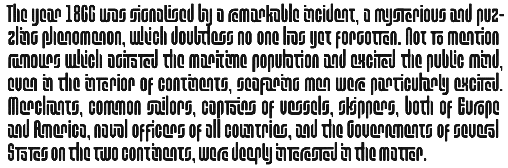
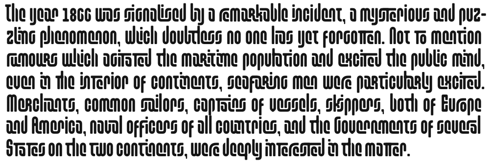
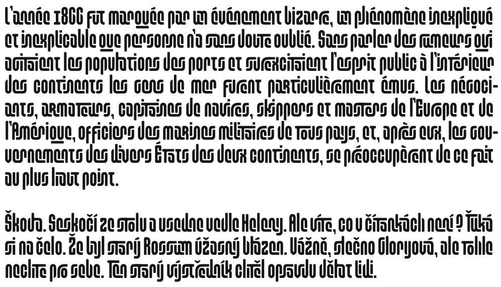
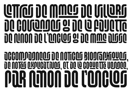
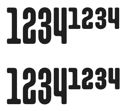
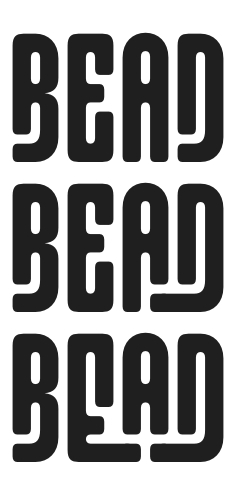
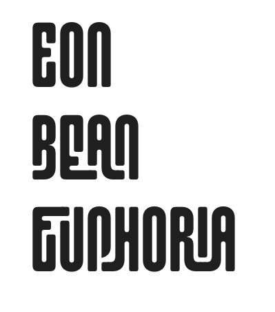
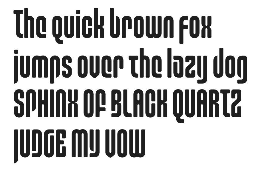
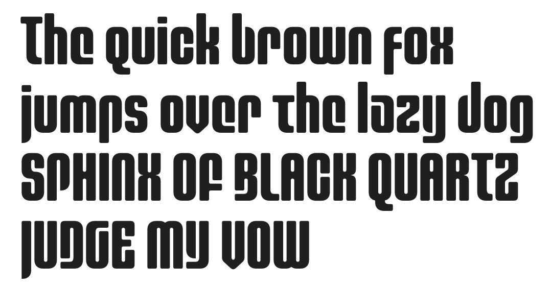
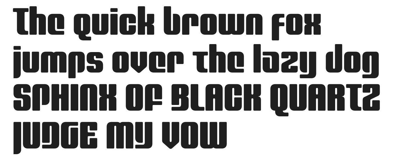
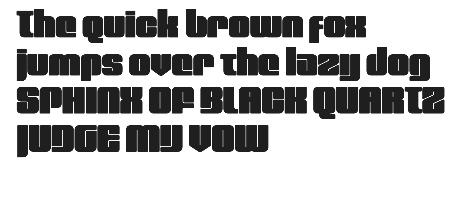
The attached sample is of a typeface that has somehow evolved out of my efforts to learn OpenType feature coding and which didn't begin with any serious goal of creating a complete font (especially given that I really have no artistic or typographic background as I fear is probably reflected in this sample). Now that I have a complete alphabet, though, I find myself wondering whether it might be worth expanding this into a full character set. Unfortunately, I'm not the most objective critic, so I was hoping for some feedback. I'm worried that the uppercase is slightly too heavy for the lowercase and may need to be redrawn.
Any feedback would be appreciated.
TIA,
André
| Attachment | Size |
|---|---|
| Alice2010MR16.pdf | 92.39 KB |