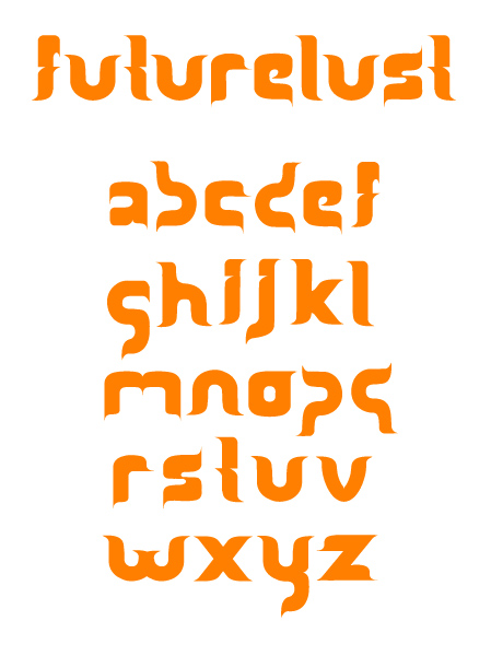
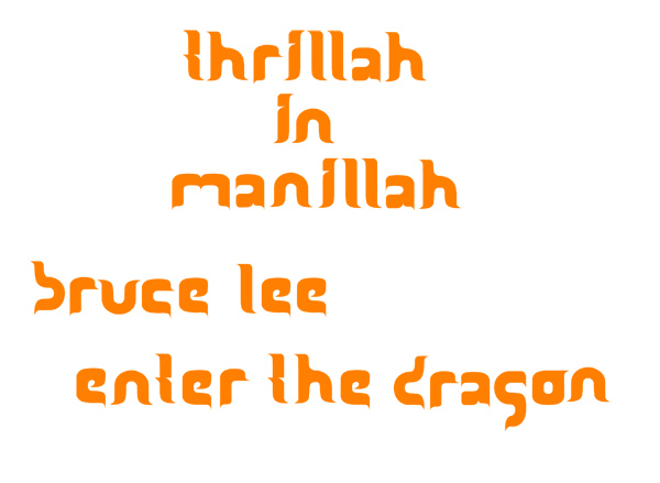
A fun, more contemporary looking font, I have not utilized this font yet but I'm anxious to put it to work in some prarcticle manner. Hammer away.
| Attachment | Size |
|---|---|
| futurelust.jpg | 666.54 KB |
| example.jpg | 641.15 KB |
A fun, more contemporary looking font, I have not utilized this font yet but I'm anxious to put it to work in some prarcticle manner. Hammer away.
| Attachment | Size |
|---|---|
| futurelust.jpg | 666.54 KB |
| example.jpg | 641.15 KB |

Hello A-type.
I can view the images in my browser. None of it. Maybe some technical problem with them?

Works fine here. You have to wait a second.

Nice concept!
I think b d g p q work very well and show that this thing has potential.
The m is also a bit tricky, the w is better but needs some weight taken out in the centre (maybe assymmetrical?). Same for the x, and also the k (maybe just move the diagonals away).
The h needs a lacuna, either on top or at the bottom of the joint (which would be less conventional and fitt better, I assume).
The o seems a bit too heavy, maybe it could do with an opening (at the botom or left) or at least a lacuna. You have done the right thing with the y there.
The e is much better than the a.
wow, so sorry I never got back to this one. Thanks for the input Tim, those are some very good suggestions. I've changed the a since then. The m is tricky indeed. Some reason m always seems to be my weakest character. I'm somewhat rusty on my typography terms, I have an idea but could you explain what "lacuna" means? no reasonable google results were found.
Lacunas are often referred to as ink-traps, or sometimes "crotches". Christian Schwartz' Amplitude is an example where they are so pronounced they become stylistic elements.
Thanks again Tim. I'll try to get an update, in the next few weeks revised with your suggestions considered, once I get caught back up with all the various projects I have going on.
Captured from web.archive.org on 16 Apr 2015. view this capture