Hi there, I was wondering if anyone would be so kind as to help me identify some fonts popular in the 70s. I have a rough idea of what kind of typefaces they are and what contemporary iterations I may be able to use in place of them, but I would just very much like to know their names and their back-stories.
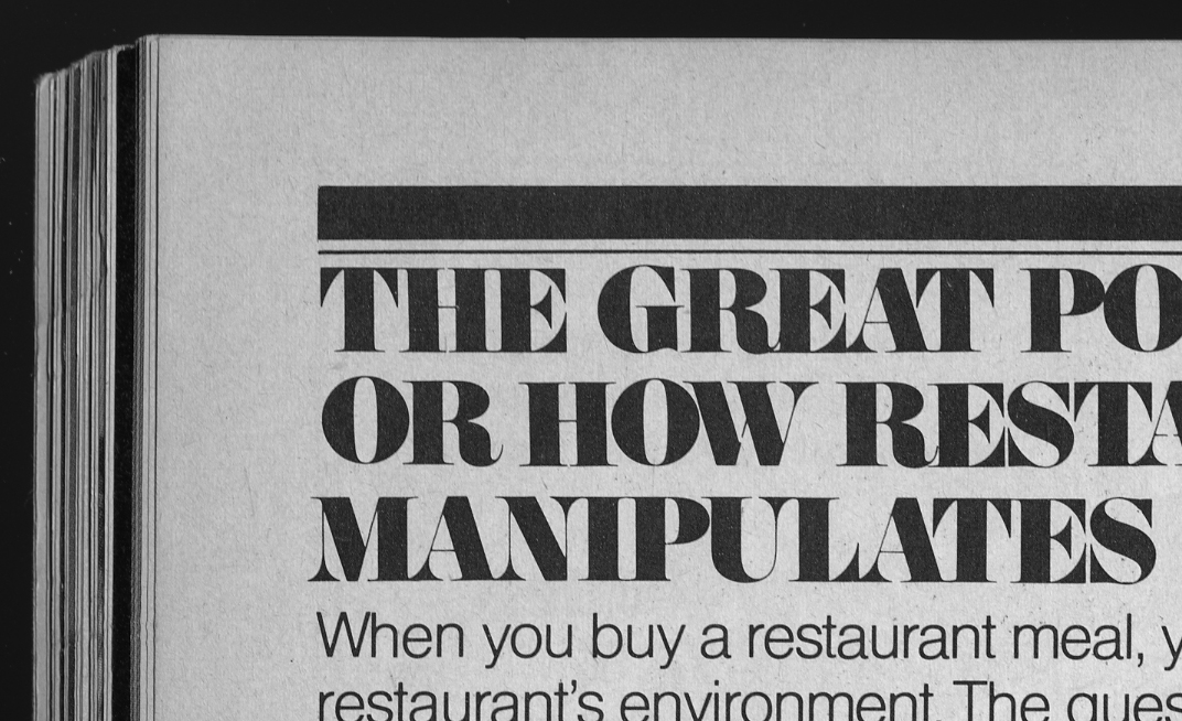
1) A hairline serif/bodoni font. Pistilli Roman? Carousel? By the size and the printing quality I'm not 100 percent sure about the porportion of the hairline to the thick stroke. Also, in other examples a few of the uppercase letters, such as the "K", have stately ball terminals.
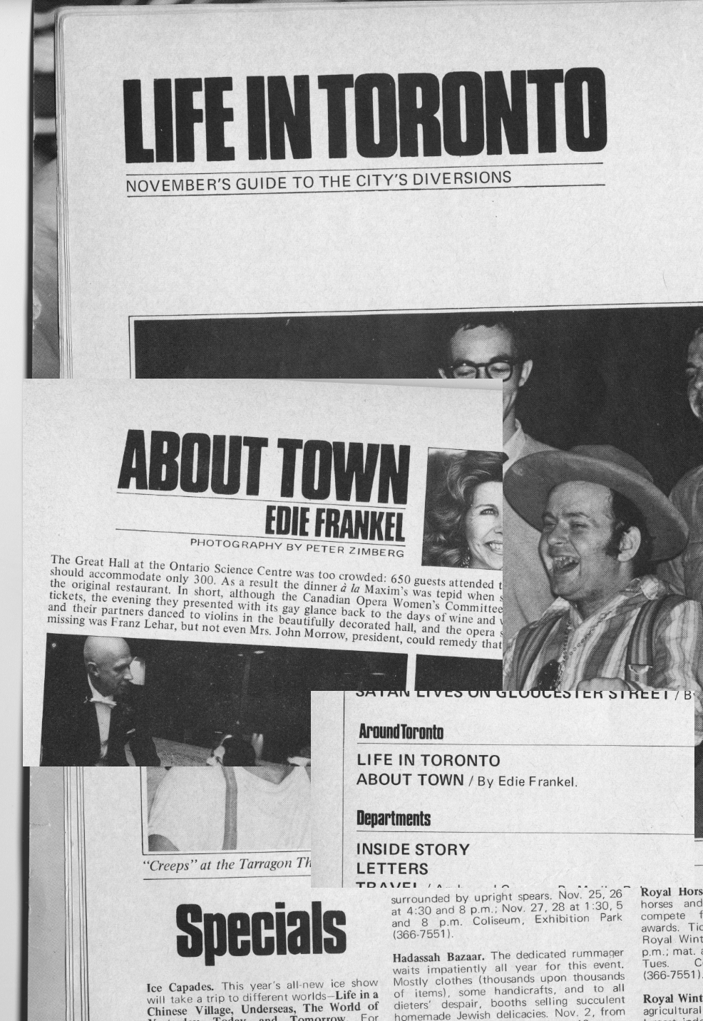
2) A condensed sans. I wonder if it's a condensed version of a giant family?
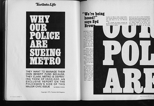
3) A condensed slab serif like New York magazine's.
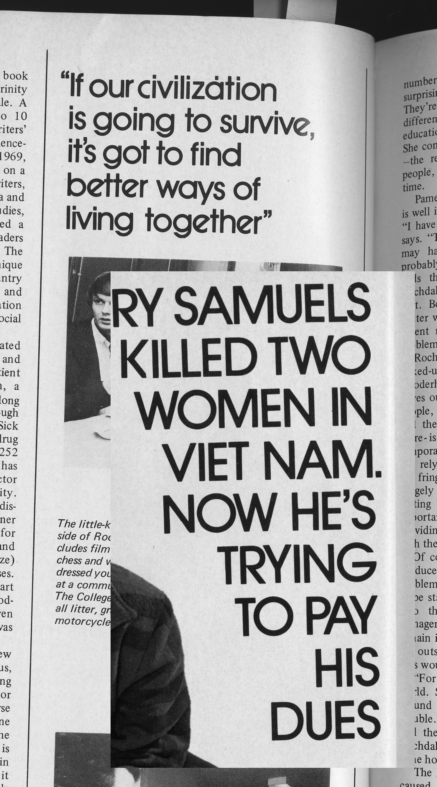
4) A geometric rationalized sans that I first thought was ITC Avant Garde, but the uppercase "K" has a little cornered edge that seems uncharacteristic of the face.
Thanks so much in advance!
| Attachment | Size |
|---|---|
| hairline_serif.jpg | 479.11 KB |
| condensed_sans.jpg | 925.99 KB |
| condensed_slab.jpg | 210.28 KB |
| geometric_sans.jpg | 880.19 KB |