Hey Everyone,
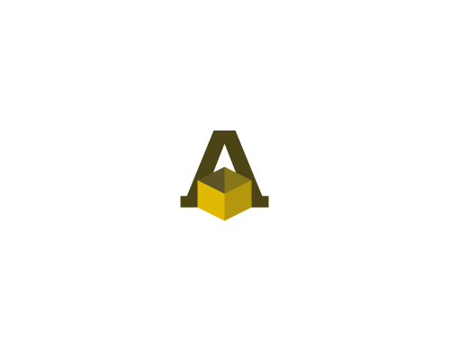
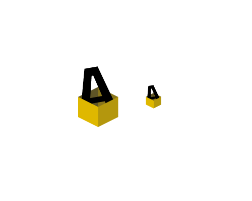
Just finished my first concept for this company and wanted to get some feedback while I work on some other ideas.
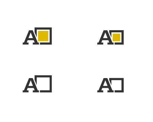
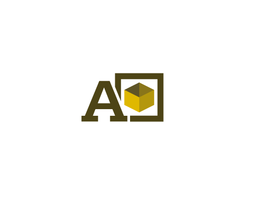
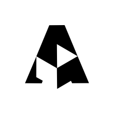
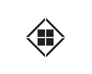
This first concept came about as the client wants to work with the letter "A"—playing off of "Alsip" and also the layout of their lot is "a-shaped".
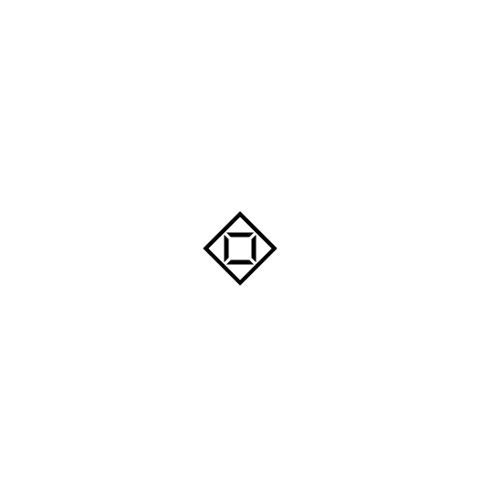
After a little doodling I noticed that a rotated box, inside an non-rotated box create A's. So you have a box within a box to show the storage aspect, and it also makes four A's that can be seen when the logo is rotated 0, 90, 180, and 360 degrees.
I didn't bother putting time into kerning yet, so let me slide on that for now.
Let me know what you think so far.
Thanks,
Mike