
Hello Typophiles!
Here you can see the latest project of mine, a quick-made, playful yet - I assume - quite legible title or display typeface.
What do you think of it? What do you like or dislike?
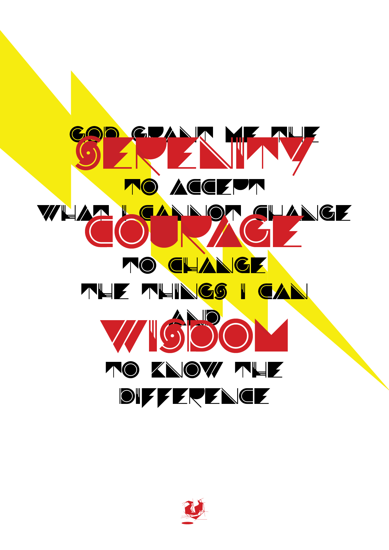
| Attachment | Size |
|---|---|
| specimen_01.pdf | 376.75 KB |
Hello Typophiles!
Here you can see the latest project of mine, a quick-made, playful yet - I assume - quite legible title or display typeface.
What do you think of it? What do you like or dislike?
| Attachment | Size |
|---|---|
| specimen_01.pdf | 376.75 KB |

Great work, I like it. Reminds me of the seventies.
Yet the T, P and R look a bit unstable - gravitationally challenged, as if they might break a leg one day. IMV the F is a bit too massive, crossing the baseline with not only a line but a triangular shape.
If you want to try alternatives:
- use a triangle instead of two legs for the R (open the bowel to compensate too much weight)
- try to give the T some kind of umbrella stand.
- give the P a stronger stem (cf. I and H)
For the F I could think of something like: upper half as it is, lower half like the H without the vertical line at the right.
Andreas

I disagree with the above, as I think much of the face's distinctiveness is that it has no need for a regard for gravity, like it makes its home in outer space. However, the lines of T and L are too thin; they ought to match the thickness of the lines in the other letters.
The B seriously looks like it may be a K. I'm reading "fakergraph".
Thank you for the comments!
Cerulean, you are right - B is quite unsure.
Your opinion is highly appreciated - I keep on working on some of the glyps mentioned above.
Thanks one more time!

Nice! Are there more characters that resemble the I & H?
I'd like seeing a few more letters in that style.
I'd almost like to see an alternate P, T & R in that style too.
Thanks Special-K!
Yeap, I'm working on alternate characters-more blocky and more I&H-like ones.
But before that here is some lowercase preview.
What do you, Typophiles, think of it?


+I like the lower case letters in general, although the f, l, g, and s [the eternal problem in this style] don't seem to blend as well as the others. The i,j,k series is very nice, but the two small diamonds in the l don't seem to help. The f and g seem too busy, too many pieces. They don't "read" as easily as the other letters. Great work, keep it up. I could be a customer! Please keep me informed.[michael@bsiw.us]
mgk
Thank you for the detailed comment, mgking!
I will let you know when I'm ready.
Not liking the "g" myself. Maybe you could make the descender more like the curve of the j or t.
Just a thought, you could probably make this into 4 different fonts based on the designs of abc, ijk, hmn, and vwxy.
Thanks Special-K!
I'm unsatisfied with many lowercase glyphs also - keeping try more and more ideas I have to have a fine set.
Also have the idea you mentioned :) thanks!
I'm thinking about a more blocky and a more graphic (much like this so far) versions, maybe as stylistic alternates in OT or separated versions.
Captured from web.archive.org on 16 Apr 2015. view this capture