
Yuri, the baroque perl
The new typeface family from Hubert Jocham
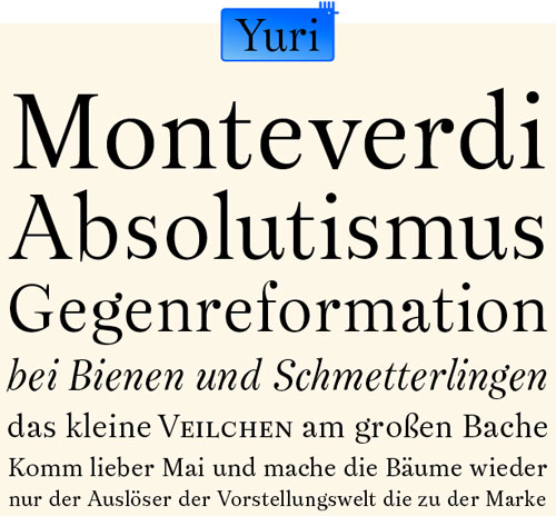
The Renaissance is one of the most important periods for typedesign. For the serif typefaces followed the so called transitional period and goes on to the neoclassicism. So you get the impression the forms, kind of, morphed from oldstyle to neoclassic. And in a way it rally did. In Germany the type of the transitional period is called Barock-Antiqua. This term is not very good because Barock-Antiquas we know are fare from the overwhelming ornaments of Baroque architecture. But in cultural history the changes never happen like a morph from one form to another. The transitional history is very rich with the vast variety of design directions from all over europe and of course from Holland.
About his new typeface, Hubert said, “As usual type classifications never give a final answer to what is really transitional. I am now very glad to finally present my new typeface Yuri. With Yuri I wanted to design a roman typeface that feels Baroque and it should not feel like one step in a transition.”
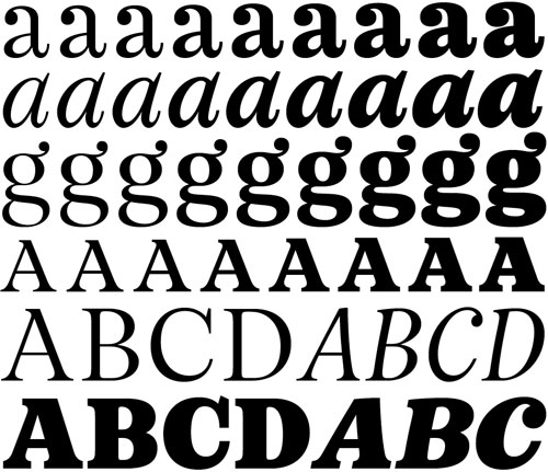
Yuri is a legible workhorse for the usage in magazines as well as books. Yuri has 9 weights with italics up to extrabold and ultrabold. The Pro version also got small caps, different sets of figures including the ones for small caps, some ligatures, Latin 2, turkish and baltic letters.
www.hubertjocham.de/item.php/type/serif/YuriPro/
www.hubertjocham.de/item.php/type/serif/Yuri/