
Hello. I'm new to this site and I'd like some feedback on a font I initially developed in the fall.
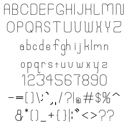
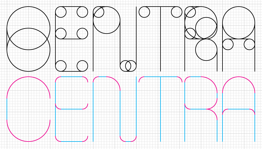
I "drew" it all in Illustrator CS and used TypeTool to actually make it into a font file. It is based on circles and lines. Every curved element is an arc cut right off a circle. You can see this in the image where I mark the arcs in magenta and the lines in cyan.
I'd like to remake this entirely in TypeTool because I'm pretty clueless with that program, and going from Illustrator to TypeTool didn't give me the precision I wanted. Ideally this is for display, so i don't see it getting any smaller than 16pt. The construction allows for multiple weights to easily be added.
So, thoughts? Any particular characters that don't work in the circle/line structure? Any recommendations for good TypeTool tutorials? Are there basic type things I'm overlooking/destroying?
Thanks for any help.
P.S. I call it Centra. The name sounds like a mash up of Century and Futura, which wasn't intended. It is supposed to suggest circles. Thoughts?

