
This is an example of Dez Squeeze Skinny showing alternate cap N and EFLT. One N will be default and the other a stylistic set alternate. Which do you prefer? Left or Right?
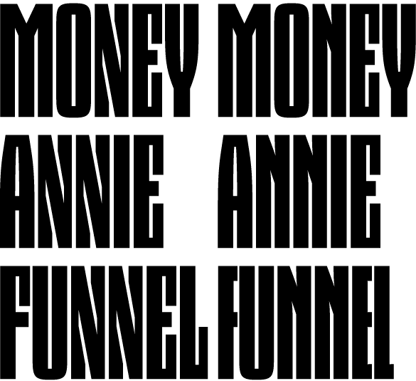
Typeface “Dez Squeeze”.
Available at dezcom.com/typefaces/squeeze/
ChrisL
This is an example of Dez Squeeze Skinny showing alternate cap N and EFLT. One N will be default and the other a stylistic set alternate. Which do you prefer? Left or Right?
Typeface “Dez Squeeze”.
Available at dezcom.com/typefaces/squeeze/
ChrisL

Can you make one like the one on the left but where the thinnest part of the verticals doesn’t get quite so thin?

Left

Right.
Michael
Interesting William... do you not think that the left N is too distracting to be the primary?
Michael
Michael, I agree it ’vibrates’ more, but I’m guessing that this will be used for only a few words as a commercial name or message, and there the distinctive attention-getting look might be better. In words with the M, the right “N” goes better, though.
“I am only seeking harmony, grasshopper,” he whispered : )
Michael

At least in this context, and spontaneously, I’d pick the right one; left one seems too busy. But maybe you want busy. :)

I’m leaning to the right on this one. I like the design of the left N, but it’s too active...
Michael, I agree the right is more harmonious. The question whether the more harmonious is going to be what people are looking for. I really have no idea, but that’s the question. I was just guessing about the likely use...
This is the opposite of Craig’s suggestion with the verticals on the basic N thinned a bit at top left.

ChrisL
Another set of words:

ChrisL
Interesting, Chris. Opening the top of the N with the daggers does calm it down a bit, which is nice, as it is more on the same level as the other characters...
Chris... why have you not done a more standard Z, i.e. with no “serifs” and no “traps?”
Michael
”...not done a more standard Z,”
I was wondering how long it would take to be noticed! :-)
The Z done that way just looks like ßhit to me this narrow.
ChrisL
If it requires a double S to describe it then it must look like **** : )
Edit: Come to think of it, now that I have seen the S, why not a serifless S? Too many worms at one time?
Michael
What are VKX going to look like?

Chris, it might help this discussion to show the existing and published solution for Dez Squeeze Fat. I’d say follow what you did there.
Edit: on the *traditional* N, the crossbar/diagonal needs to be thinner IMO, more like the M.
Here is a pangram in Dutch in variations:

ChrisL
Thanks, Randy, good idea! Here is a link to Dez Squeeze Fat on MyFonts:
http://new.myfonts.com/fonts/dezcom/dez-squeeze/fat/
ChrisL

I find the left much more readable and interesting. After reading them, I noticed that the gray where my eyes are blending the black and white makes a horizontal shape in the left and a mountain shape in the right.
—- and /\
The mountain is distracting to me.
Nice Chris, very well thought out.
Michael
I thinned the transversal on the alternate N as Randy suggested. I also am posting a little comparison of Dez Squeeze Skinny with Des Squeeze Fat so you get the comparison of mass to verticality.


ChrisL
PS: Thanks, Michael!
Now I see the reason for the obsession with the traps in the N. Is there an alternate S Chris?
Edit: It just seems so big and wide... try it without serifs... o.k. I will shut up now : )
Michael
P.s. I wanz a vixen too! Is that a personal ad Chris :-)
Michael
Michael I have resisted opening the Pandora’s box that comes with the S. Then would need to be the C which then screams for the G but what can be done with the G? Actually the S does not have serifs. It is just the typical closed form of a sans serif like Helvetica or Univers. The E, L, and the Z are hard to rationalize though. I was trying for blackness and a minimum of holes to promote knockout of photos and a heavy weight.
ChrisL
PS: Your Ad, Michael:
Wanted, Vixen with No Traps! Serifdipidy welcome, though :-)
The extremely condensed bold sans are hard to resolve and you have done it nicely. The spacing (white space) is tough and yours is very even... congrats.
P.s. I have found that if one tries to hire a vixen there is always an undercover serif there to arrest you : )
Those Ba(s)tardes : )
Michael
Just don’t shoot the Serif! :-)
ChrisL
Sorry to interrupt the puns, but I’m finding the top of the M a hair too light and the bottom of the W very light. As you were gents.
Gotcha, Randy.
ChrisL
right

The left one is the one that does it for me, personally.
Thanks, Kári.
I think I will keep the left as default for the 5 widths of the family since it works better as it gets wider. The Stylistic sets will be there for anyone who prefers them.
Randy, I fixed the M and W, too.
ChrisL

I envision this becoming the Trajan of book covers.. you know the thriller kind with embossed fluorescent metallic type. The New York Times Bestseller list will become a Dezfest. Airport bookshops will be crawling with Sqeeze. Someone will register the website BanDezSqeeze.com, from whence they will launch a guerrilla sticker campaign. Then we can all login to Typophile and lament how popular it’s become, the thoughtless choice of lazy art directors, and we’ll have to start a type battle called “Fix Squeeze” that nobody will be able to improve upon, meanwhile you’ll fly to type conferences in the DezJet, sponsor the rocking font-herd all-night parties, and relax by swimming in your vault of royalties. But perhaps I’m getting ahead of myself?
Which is to say what I should have said before: this is really good. Squeeze comes into it’s own in narrow. Congrats.
LOL!!!
MAN! Top That! (was that a novel idea :-) Thanks, Randy! And thanks for all your help over the years with my questions!
ChrisL

ChrisL
Captured from web.archive.org on 13 Jul 2009. view this capture