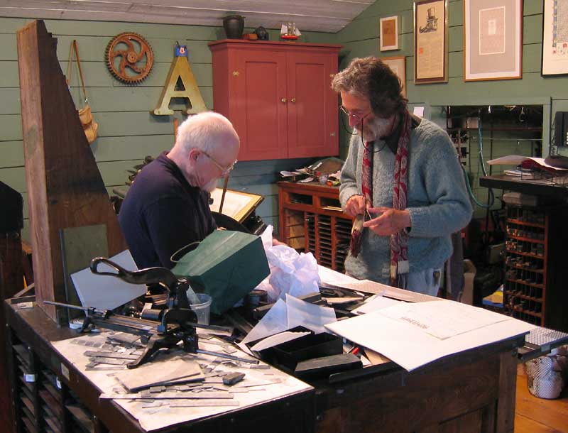
Gerald Giampa, letterpress printer extraordinaire, former owner of the Lanston Type Co., pioneer in the conversion of metal to digital type, and contributor to Typophile, has died in Vancouver following a massive stroke. An obituary is expected in the Vancouver newspapers, and a wake is being planned for 31 July (location to be announced).
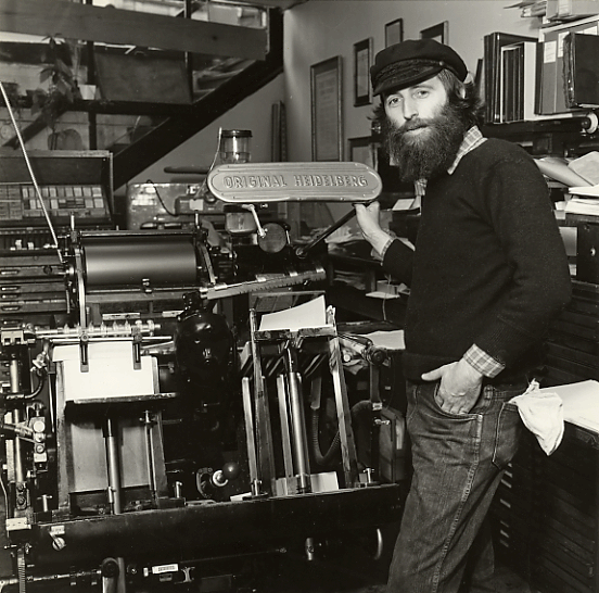
Gerald had many friends and colleagues who knew him better than I and for longer, so I'll restrict my comments to a few personal recollections and acknowledgements. In recent years, we had some heated disagreements and at times he expressed opinions that I found repellent, but the sense of gratitude I feel toward him remains. It was in large part due to his generosity and encouragement that I started down the path that led to my career as a type designer. When Ross and I met Gerald, in the early 1990s, the Lanston Type Co. was based in Vancouver and he operated an open-door policy to anyone with a genuine interest in type, even neophytes like us. Gerald had a strong sense of historical continuity in his chosen crafts of printing and type founding. His office space at Lanston, with its memorabilia of Frederic Goudy and other former Lanston associates, embodied this continuity even as it sat next to the room where the Ikarus tablets were used to convert metal type designs into digital fonts. But digitisation was only part of the work going on. New designs were also being developed, notably Jim Rimmer's Albertan. Even then, the Monotype matrix punching and finishing machines were in occasional use, and sometimes one was greeted at the door by the sound of the Heidelberg presses running. By that time though, the customers for hot metal type and for the kind of quality letterpress printing that Gerald offered were few and far between. There was a sense that the kind of work he wanted to do was increasingly difficult to find and to justify financially. A lot of time was available for talking about type and printing, for looking through drawers and specimens, for making plans and, it must be said, for drinking. Gerald made no bones about his alcoholism and, as he explained, treated the wine glass as one more lever on the press, to be pulled in sequence.
Colleagues came to visit. Sumner Stone came, and Gerald cut metal patterns of Stone Serif, perhaps the first type designed for a digital medium to be back-engineered for hot metal setting. Dave Farey came to draw new weights for Lanson's Bodoni. It was on the back porch, under the grape vines from which Gerald made his own wine, that I first met Mike Parker, drawn to Vancouver by certain rumours regarding Times New Roman. When Ross and I attended our first ATypI conference, in San Francisco in 1994, it was with introductions to Matthew Carter and Dave Farey, courtesy of Gerald.
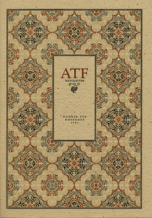
In 1986, John Dreyfus visited Vancouver and paid tribute to Gerald's skill in the arrangement and printing of printer's flowers and ornaments. I believe Gerald cherished this tribute more than any other:
Gerald Giampa is especially original in his choice and combination of various coloured inks, and also in the skill with which he eliminates parts of a flower in order to obtain a simpler and more striking effect. He super-imposes colours with great subtlety, so that they blend in the most harmonious way. He succeeds because he plans his effects with meticulous care. His handling of printers' flowers combines knowledge and skill with taste and judgement. So my final typographical bouquet goes to the printer of these lines, to whom the words of the prophet Ezekiel (8:20) can be aptly applied: ‘As for the beauty of his ornament, he set it in majesty.’