
Hello,
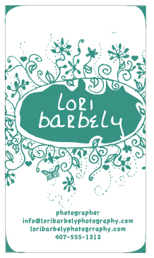
How is this working? This is for a wedding photographer that wants to appeal to the less traditional bride, but not alienate the more traditional bride. She selected the color.
thanks for your advice!
Hello,
How is this working? This is for a wedding photographer that wants to appeal to the less traditional bride, but not alienate the more traditional bride. She selected the color.
thanks for your advice!

I like the card. The type doesn't fit within the space you gave it, though. I'd forgo using a font and hand write it.
You are right, I was just being lazy. Good call! Is the secondary type working okay however? Or should I handwrite that too?

Sorry, double post
I like it! Just simple as that.
I do have to place one comment: looking at the elements it doesn't become clear it is for a photographer. I would like to see a few reference points for that.
Further, job wel done!
O, one thing. I think the centrered text should be equaly placed. It is too perfect.
What kind of material will it be presented on?
bobbybobo,
thanks! I know that is my concern too...but I am not sure what to do to make it more obvious. To me it would work better for a cake decorator or an invite designer or a seamstress ...but what can I do to make it look more like a photographer that is not cheesy?

Perhaps you can explore the artistic style currently being used, with an illustrated camera. OR perhaps more emphasis on your Name and Title. The latter should read "Pictorialist" for an added layer of fun. A pictorialist references the photography folks of the late 1800's and earily 1900's exploring various methodology to produce a "painterly" effect, and more over, to show the public that Photography IS an art. Your business card has a 1800's Victorian flare to it and I would advise that further exploration of that period will give you a unique look and feel your looking for.
best regards,
daniel

Note that at the moment you appear to have too many rs in the URL ("photogrraphy")
_______________________________________________
Ever since I chose to block pop-ups, my toaster's stopped working.

I personally would not worry about the photography or camera aspect of the card. As you said, this is about wedding photography, so lenses and shutters are too literal. I think it's great for the purpose, perhaps handwrite the title as suggested and, perhaps, try a straight, no nonsense font for the details (for contrast).

My suggestions:
1. Make the secondary matter as large as possible (within the contsraints of the design) and the word PHOTOGRAPHER even more, so that it stands out.
2. How about losing one of the lines by combining the e-mail with the url, like (info@)loribaetcetera?
. . .
Bert Vanderveen BNO
How about placing PHOTOGRAPHER at the top?

This is a total design reversal, but if I recall my youth, Victorian pictures were often presented in oval frames that contained ornate bric-a-brac designs in the corner. So moving the decoration outside of the oval, and putting the information inside, where the photo (we called them tin-types back then) went might create an impression that is more photographic.
Just an idea.
Hello,
How about this? I did the hand drawn title and the client didn't like it.
thanks!

Mmmmm.
In a way an improvement, but I did like the look and feel of the first one.
But it is more obvious that it is for a photographer.
My 2¢: Why the assymetry in the main oval when the whole card is centered?
lori barbelly should remain on the same line, or be done as draft one. The details below are now relatively smaller than before, why?
I like the 2nd one. I think its more clean, professional. However, you can try positioning different way, like rotated it 90 degree counter clockwise, and use different typeface for the information, like gill sans or something clean and easy to read for larger audience. I like the hand-draw, very cute.

As for the type inside the decoration, use your own hand writing. don't be afraid to combine a clean san-serif such as Helvetica or Avenir with the decorative design to you info at the bottom of the card. adding contrast between image and type sometimes work.
I like your first mock up better. I like the feel of the font you chose better than your handwritten attempt in #2. But i agree an original handwritten would look better, keep playing with it. I do not think you need to stress the photographer aspect at all. If you do maybe make it on the back of the card? Or with a tagline?
"making better pictures for beautiful people"
"from honeymoons to brides and grooms"
"Snap and Shoot for you? I do!"
lol just having fun :)

Hi there,
The first one that you had took on this playful, victorian meets cute style, and I liked it. I think that the brown is a much darker value - I'm sure if you desaturate this thing, you'll see that the brown is a lot darker, and for some reason, it feels like too much contrast - like it's competing with the rest of the layout.
I liked the victorian elements to the first mock up, and think you should push it further in that direction. A lot of cool stuff came out of that time period.
ALSO, this all depends on what kind of photographer this person is - let their style determine your concept! If they shoot kids a lot, then I think you're headed in a good direction.
Good luck!
daniel
Thanks everyone!!!
i am unable to get that what the relation of this image with bride?
Thanks & regards,
Mark Spenser,
Marketing Manager,
Plaveb Corporation - Web Agency
USA
Captured from web.archive.org on 18 Feb 2013. view this capture