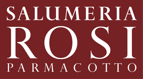
Trying to identify a font (obviously) used, in two weights, in a logo. It's quite similar to Perpetua – some of the key differences: bowl doesn't meet the vertical in the cap R and P; the cap U is stemmed.
Thanks in advance
| Attachment | Size |
|---|---|
| rosi_logo_sample.jpg | 35.92 KB |