| Attachment | Size |
|---|---|
| strobe.jpg | 991.67 KB |
| Attachment | Size |
|---|---|
| strobe.jpg | 991.67 KB |

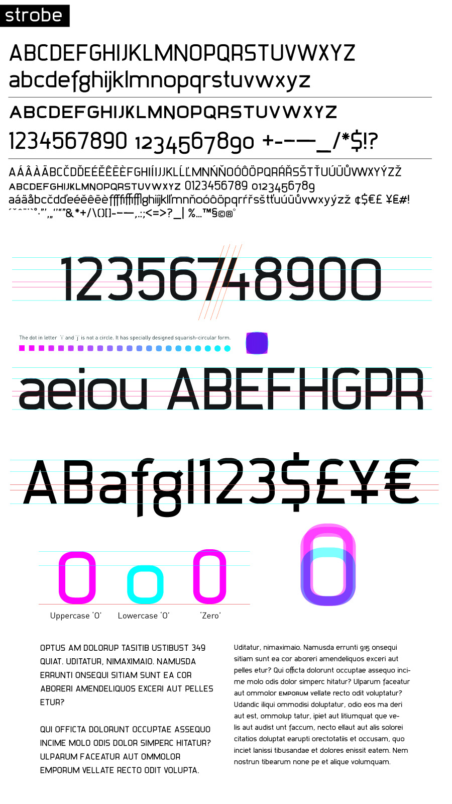
I don't think the 'g' is working. Maybe go for a non-binocular 'g'?
[edit]
Why aren't the descenders equal in length?

Nice design. The tall numerals are a neat idea.
I like the g, but I'm always the one who likes a distinctive g when nobody else does.
The s looks upside-down. I'd extend the lower left end some.
The way the N dips below the baseline works fine in the full capital but is too exaggerated in small caps.
The question mark doesn't really seem to fit the face.
http://www.syxra.cz/temp/Strobe-Sheet.pdf
Thanks for the comments, here is next version with mostly all of them incorporated. I was saving this g for cursive version .o)
Have you tried the new 'g' with the same top-right part as the 'q'? I mean with the little pointy-thingy. ;)
Not yet, but I will certainly do, as soon as I'll get back to this typeface. .o) It seems like wise idea...
Well. All the time, I'm surprised that nobody commented width of capitals. Are not they too narrow? I am starting to feel it like this, after couple days...
Well, there are very few comments to begin with. The crit-boards are rather quiet lately.
V X Y are too narrow, and some like C D H could stand to be widened slightly, but no, I don't think the capitals in general are too narrow.
Thanks for your precious opinions, I will surely incorporate that. Although I'm working with typefaces over 15 years, it's still quite hard for me to come with constructive critique.
The floating descenders were rather an artist's wish than a typographer's choice. Clearly a mistake as well as the VXYCDH width..., however the biggest issue in sans serif for me is always S, paragraph, question mark, cedilla and & (Et) sign together with numbers. Arabic numbers in roman alphabet seem like from a different planet .o]
Captured from web.archive.org on 14 Apr 2015. view this capture