Typophile

Kerning Problems?

row442

Hi everyone,

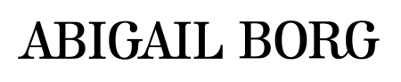
I am struggling with the kerning on this text. The 'abig' in Abigail seems to really stand out as disjointed to the rest of the word. I can't seem to get it to look right.I have had ago at ammending the text but don't have much experience in this area so would welcome any advice.

Original

my try

Thankyou!

The first one looks like someone entered the name into an online type tester and took a screenshot.

The problem I see with this typeface (Linotype's Kursivschrift Stehend) being set so tightly is the white space between AB and AI that results from avoiding the serifs to overlap.

Hmm...?

Thank you that looks and flows alot better! Thanks again

Captured from web.archive.org on 25 Jul 2014. view this capture