
Not really (not yet) a typography critique request, it's "only" about the font selection/pairing: Am I crazy, or do these two really look quite happy (or at least interesting, and definitely not bad) together?
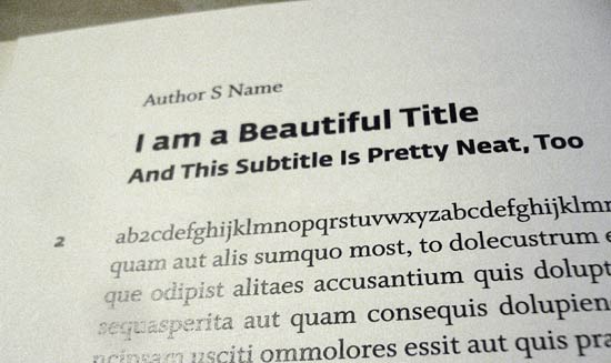
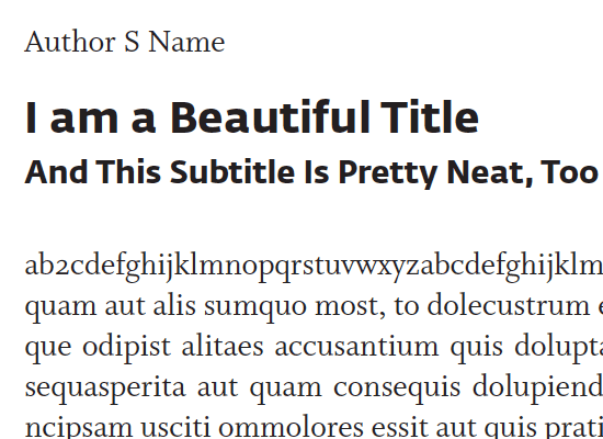
To my eye, they seem to click – in an interesting and not quite friction-less way. Maybe beyond the surface differences of their curves, they share some "deeper" character traits that make them work together – a certain tautness/springiness maybe, which of course is much more overt in Fedra (which is fine, since it's playing the display part here)?
But does that make any sense, or am I over-brainalyzing things?
My eyes say it's good, they think, but I'm not sure.
.
In any case, of the faces FB recommends as being "compatible" with Whitman, I only have a couple weights of ITC Franklin, and that looks a bit lazy/plump next to Whitman (& nothing against Franklin, I'm using it in a different book currently where it works great).
.
In any case, Kent, if I haven't said it before, congratulations, and thanks – Whitman is truly a thing of beauty, and already a joy to work with! :-)


