
Need some help ID’ing this font. Can anyone help?
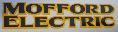
Need some help ID’ing this font. Can anyone help?

My impression is that this is a customization that started with Friz Quadrata. Note especially the crotch of the M, and the way the R is formed.
- Mike Yanega

Chuck Davis’ Kona Bold is very close.
Funny, it looks like the M in Kona Bold was tweaked to make it sort of like the M in Friz. The E and F alternates look like the sample lettering. That must be the one Yves.
- Mike Yanega
Either that or the logo was designed by Chuck Davis. The Letterhead Fonts designers are all (?) well versed in hand lettering and logo design.
Captured from web.archive.org on 2 Jan 2010. view this capture