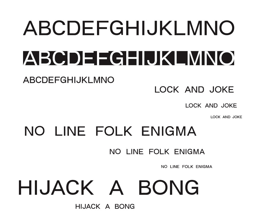
So I decided to finally try my hand at designing a typeface. I don't really know what I'm doing, but I've been reading and piecing together a technique based on what I see other people doing. My ultimate goal for this project is for it not to be awful. My initial plan was to design a multi-purpose sans serif typeface that is neutral enough to be used for virtually anything, but with enough personality to not be bland.
I only have capital letters A-P drawn so far, but I would like to post what I have so I can correct any obvious blunders before I get too far into it. Be critical, but be nice!
Thanks!