Hi everybody!
I'd like to get some criticism about a logo I'm working on for a contest in my design school.
Cresco (in english it's GROW) is a project which deals with sustainable development. It helps companies to share their sustainable ''habits'' with citizens, and its main areas of activities are:
-energy saving
-recycling
-sustainable transport
As for my entry, I decided to approach the broader concept of ''sustainable development'' rather than focusing on one of the 3 areas (and hence leaving the other 2 out).
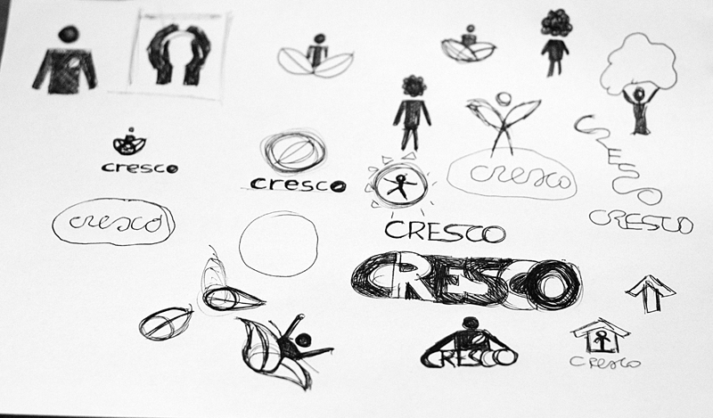
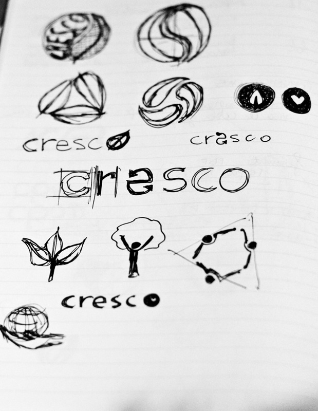
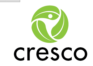
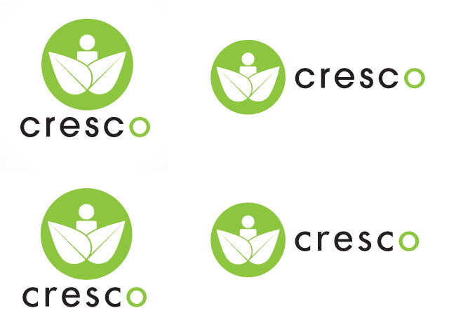
After some sketching I came out with this pictogram which symbolizes a human being ''growing'' from leaves (nature - the environment).
My choice of lowercase letters tries to make the logo more friendly, and I chose these fonts (avant garde and futura) because their kind of ''circle based'' and it connects them to the pyctogram, which is round.
Also, they're "safe" fonts.
I'm not happy with it though, what do you think?
| Attachment | Size |
|---|---|
| CRESCO.jpg | 117.12 KB |