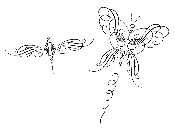
DeSoto is a family of 4 faces based on a few letters from a 1958 DeSoto magazine ad. It's an extended width titling face with a luxurious yet warm feel. Each face is fully loaded with features including old style numbers, case-sensitive punctuation, alternates and ligatures, fractions, swashes and ornaments, and Central European language support. Joe Newton at Veer created the butterflies with ornaments and swashes.