Typophile

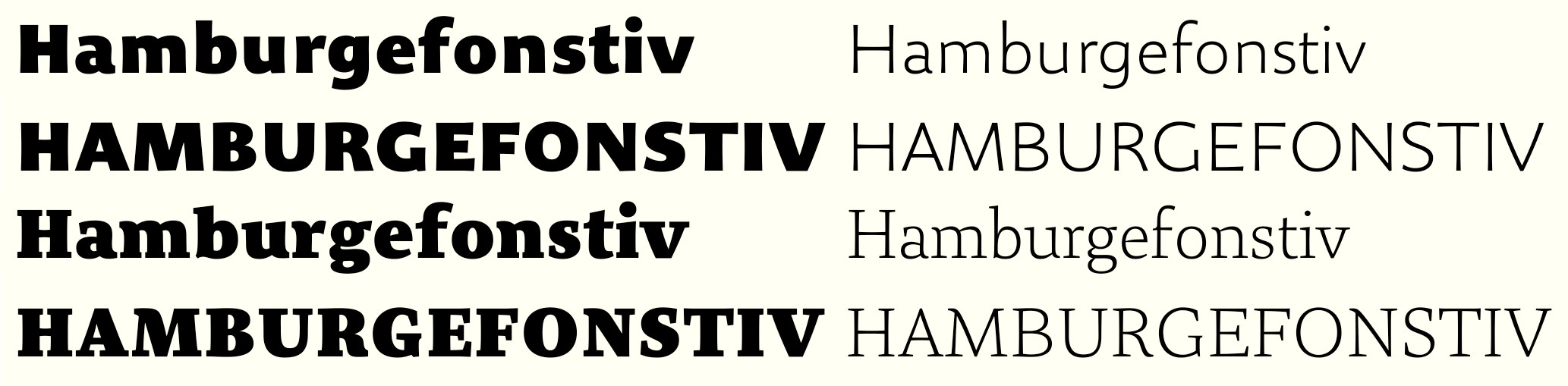
Organon Sans - companion face for Organon Serif.

Nick Cooke

Started messin' about, and before I knew it I'd got carried away.
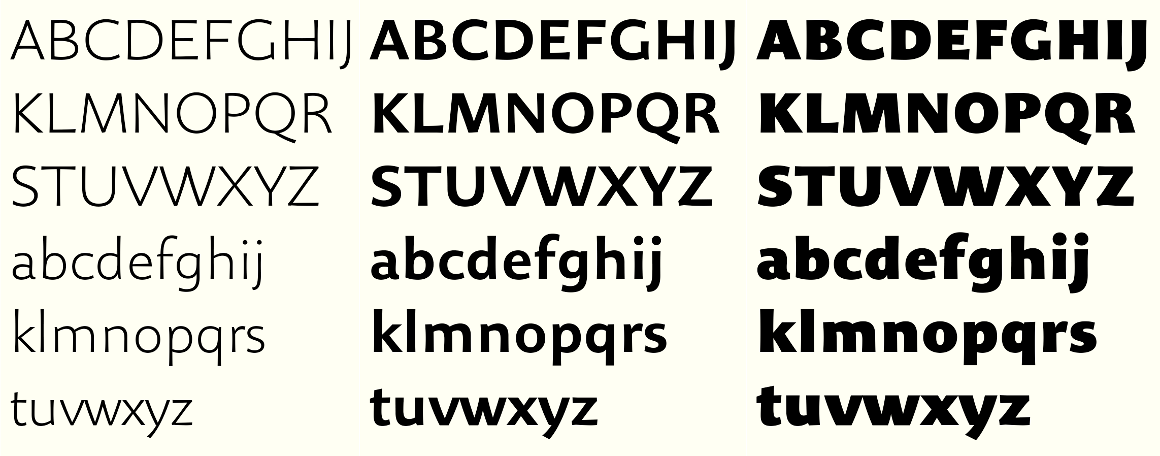
Here is a new sans family to complement the Organon Serif family which I recently completed. Organon Sans will have the same six weights, have same stem thickness and x-heights as the corresponding Serifs.

If you compare character shapes of Sans and Serif you can see they are not always the same, but there is a familial resemblance.

Here is the other image...

Try this...

Very nice work!
There is one thing i don't really like: it's the dynamic of the "n". I prefere the round start of the "d".
I realise now that you had this difference in the serif, were it works quite well, still i'm not fond of this "style" in sans serifs, for me it always looks too hard.
Also, what about an old style "g"?

This looks fantastic!

The only thing I could suggest is that the top of the vertical part of G looks a little bare somehow. Maybe it the top could be raised a hair, or the inside contour could flare a touch more, or something?

Just curious, did you try a Kk with a horizontal connector?

For the light weight:

The B looks a bit stretched.

The G might be a bit too open and wide.

The W looks a bit heavy.

Jeremy Dooley
www.insignedesign.com

Captured from web.archive.org on 14 Apr 2015. view this capture