Typophile

Tricky-typeface like musical one

Dot

I'm working on a logo for something that's connected to classical music.

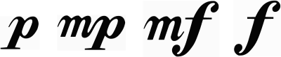
The logo will contain letter "a" but the problem is that it has to look like it has derrived out of same typeface that is used for writting musical dynamic indications which are: piano, forte, mezzo-piano. Does anybody know which typeface is used for these indications? I do NOT need typefaces used for writing musical notation!!! because there isn't any "a" in it. I need a typeface that looks like the one in which piano, forte and mezzo-piano are written.

I will attach how they look here.Pay attention that they are written in CURSIVE so I need my "a" in cursive as well:
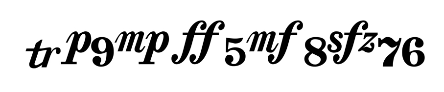
The exit and entry strokes and slab-like serifs without brackets are typical for modern serifs like Bodoni or Didot. An alternative with less contrast is Walbaum.

Can't you pull an 'a' out of '8va' ? Or are you strictly limiting yourself to the style of dynamic markings?

If you download the Coda Finale demo then it comes with a font called Sonata that has all the musical notations. It's been a long time since I've done this so things may have changed.

There are definitely fonts that are strictly for scoring music.

pbc

Paul, I believe a musical notation font is what Dot said they don't need.

This is interesting. Frode is right but it's not quite un-tricky. Many Bodonis/Didots don't have the soft/"scripty" instrokes in the italics; but then some Baskervilles, which would seem like good matches otherwise, have the semi-ascending "p".

Here are a few faces whose bold italic cuts look like they might work:
Scotch Modern
Century 731
Berthold Bodoni Old Face BQ (quirky "p")
Also nice: Teimer (no foot serif on the "p")

Kentlew-no, it has to be in style of dynamic markings.
Paul Cutler- I don't need music scoring typefaces, they don't have what I need.

Altaira, thank you so much for your suggestions, I will check them out to see if it works.

Paul Cutler- I don’t need music scoring typefaces, they don’t have what I need.

The point he is trying to make is that the letters may only exist exactly in that form in fonts created specifically for musical notation and thus missing what you need. aka, it may be impossible to get a perfect match. However, Altaira makes some good suggestions, so hopefully one of those is close enough.

Thanks everyone.
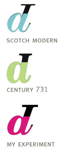
This is what I did- Scotch modern is pretty close so I figured "a" in Scotch modern is practically "p" upside down (with just some smaller differences)so I just took "p" out of music notation type and turned it upside down and drew "a" out of it. This is how it looks now.
What do you think?

Good solution. I'd neaten up the counter though, it looks somehow wonky at the bottom.

Hm… dunno, I'm hesitant to comment without seeing the entire composition/logo. I'm pretty convinced the fonts I recommended would look neater / more harmonious than the –somewhat disjointed*– letters from your sample (and it's *exactly* the "small differences" that can make all the diff really…). One would have to see the whole thing to be able to judge whether your "sampled" one looks neat/coherent/harmonious enough, or conversely, if a different typeface would look "music-like" enough. Make sense?

*I mean look at those weights!

Altaira, here is comparison with Century 731 and Scotch Modern- "a" is in both cases copy of "p" upside down. Only in Scotch Modern the difference is in angle of this flat part of "a" (don't know how it's called -is it stem?)and length of it. In Century731, even the angle is the same, so I did the same in my case.

I see what you mean, and sure that "a" can work as an "a".
My question was more about what other glyphs will be in your logo, and if these funky letters from your sample will be able to do the job, or if a more "polished"/"normalized" typeface would be better for the overall impression of the logo. There's really no way to tell that by staring at a single "a".

Captured from web.archive.org on 6 Mar 2015. view this capture