
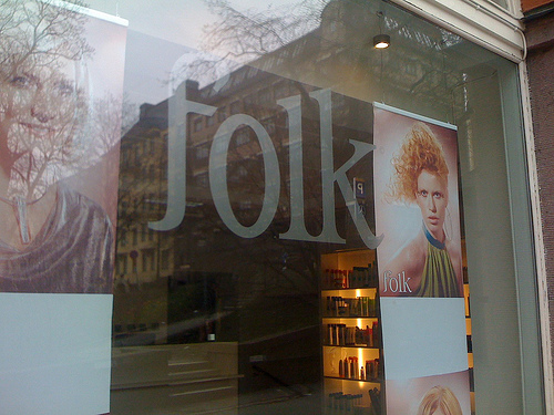
A hairdressers logo with sexy serifs, i wonder if this is custom(ized) or not? Anyone got any ideas? Thanks!
A hairdressers logo with sexy serifs, i wonder if this is custom(ized) or not? Anyone got any ideas? Thanks!
Looks like a modified version of Garromond Narrow Light
http://new.myfonts.com/fonts/adobe/itc-garamond/narrow-light/index.html

It may come from a Garamond, but I don’t think it’s ITC Garamond. The relative height of the l and k isn’t right, and even the k leg position is different, assuming you accept that the end of the k leg was modified. It seems that too much would have had to change, although I know anything is possible.
- Mike Yanega
Yes Mike, I agree that its not ITC garamond. The serifs are too rounded compared to this.. and yes I also think there could be some modification on the f and k, still most could/should still be derived from an original font I believe. More opinions more than welcome :)
I have been searching Garalde typefaces looking for similar k structure (ignoring the flip leg), and it seems that Zapf and Goudy have used similar leg placement in some of their typefaces. The lower leg of the k connects close to the stem, but on the upper leg. Zapf’s Aldus and Zapf Renaissance look pretty close to the k used in the logo.
The initial f looks very customized, and it surprises me that a hair salon would have a custom logo, unless this is a large chain of shops.
- Mike Yanega
I guess my conclusion is that this is certainly a custom logo. If I had to pick a starting point, I would use Zapf Renaissance Antiqua, and I would shorten the l so that the serifs on top of the l and k are stepped, such that the top edges of the serifs form a straight line. Then I would clip off the leg of the italic k and transplant it on the Roman k (and then probably tweak it a lot). The f would be a challenge for me, because I have no skill at this (obviously), but I know this would be relatively simple work for any one of the font designers who hang out here.
Your original question was whether this was a font or custom, and I vote the latter.
- Mike Yanega
Great insight Mike, thanks for looking into this. I hope it intrigued you as much as I did ;)
It certainly did, because it had a professional look to it. Thinking that this must have been a franchise hair salon operation I looked for, but could not find, this hair salon on the web, so if this is a one-off shop I am really surprised they would have gone to the trouble (and presumed expense) of having a custom logo designed. Two things occurred to me: 1) It is cheaper than I think to have a logo made; or, 2) This lettering comes from a font I haven’t found yet.
The f has some attributes of an italic f, but it is vertical. I think if I see that f anywhere I hope I can remember this thread.
- Mike Yanega
I did an extensive search for legible serif fonts yesterday and stumbled upon a few likely suspects that could have been used as a starting point. Although each one would need specific unlogical customisation to achieve the exact result (not considering the f), i think Valfieris by Insigne comes quite close.
http://www.myfonts.com/fonts/insigne/valfieris/regular/
The serif details would need to be straightened and skewed a little on the ascenders, and its not as condensed as the logo but still the k is remarkably similar.
As for the mystery of custom font logo, I think the answer lies in the fact that hairdressers may have friends who are doing graphic design, and therefor can have a nice logo done for cheap.
I wish I could remember where i found this image though..could shed more light onto the whereabouts of the salon itself or the designers..
Mike, I found the source: http://subtype.org/modified/
it’s in their modified section, so it’s definitely a customised font, not all original. Ive mailed Subtype asking to shed light onto this for us, but unfortunately they haven’t replied :(
Captured from web.archive.org on 7 Jun 2009. view this capture