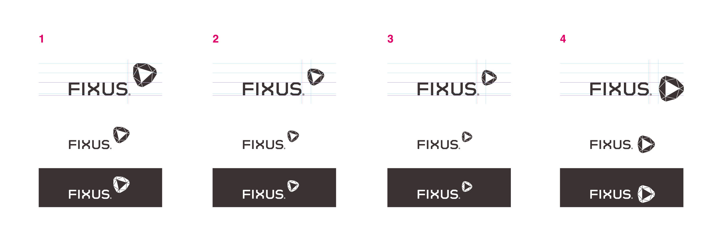
Hello guys. Can you give me some advice on the type, positioning and maybe color sugestions?
Any critique is welcome.
I havnt studied color options yet and the logo’s for a friends it and networks solutions company.
Its more or less a restyling where the only element of relevance on the old logo was a perfect triangle.
Thanks in advance