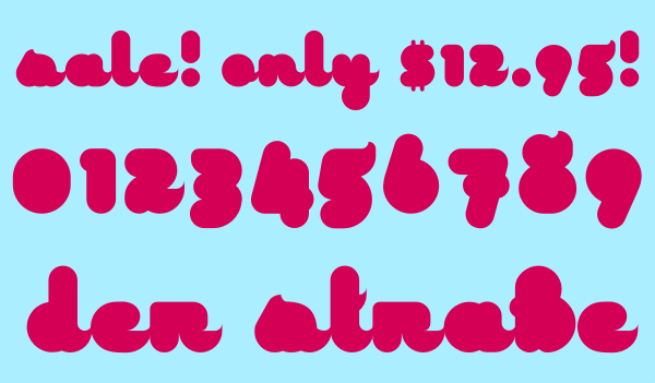
I have enjoyed typography for a few years now, and have been following the typophile forums for a while, and I finally got the nerve to create my own font that wasn't made with Fontstruct.
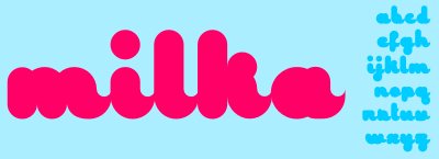
Milka is a display font meant to be used large and for short phrases, not entire sentences. For now it's lower case and minimal punctuation only, I haven't started on the numbers.
I would like some critique and suggestions, there are some characters I'm not too thrilled with (particularly r, v, x, z, and ?) and it would be good to have some input. I attached a specimen pdf.
| Attachment | Size |
|---|---|
| specimen2.pdf | 63.45 KB |