
I've made this logo +10 years ago

i think it's gently getting old and i'm looking for a way to actualise it, not a major refoundry.
Any suggestions ?
I've made this logo +10 years ago
i think it's gently getting old and i'm looking for a way to actualise it, not a major refoundry.
Any suggestions ?
I've tryed to modify the color use

What do you think

The new fill doesn't make it look modern at all I'm afraid.
I think it's time to redesign the logo.
i'm not sure the client will accept that. They've gone to a brand consulting company to ask if the redesign of the logo was necessary, the brand company say 'no, the logo is still good, there is no need to redesign'. The company didn't ask me anything about the logo it is a personnal research. You can see the logo in context here www.moovemail.com , a website (and logo and namefinding) i made for them last year.
Maybe if i have enough opinion here about redesign needed i can show to the client.
So you can just vote if you please redesign or no redesign need? Now is One for redesing (zevbiz).

This is all very subjective but I do like your use of colour in the second approach. If you can't redesign at least you can change it's relationship to its surrounding graphic elements.

The DF combination is quite good. I'd only change the "i" to make it more bold and more compatible with the first two letters. "i" also has a completely different angle than the first two letters.
But please keep colours as they are. You need a BW logo as well, so colour changes just won't do the trick, will they?
___________
Robert Koritnik
so, point 1, The Shape. As i remembered, i italised more the i to make the logo more dynamic.
As suggested anyway, i made few changes. so there is 3 versions.
the first is the unchanged logo, the second i skew back the i to mach the DF and make it
a little bolder, the third is almost the same as the second, i a little more bolder, but i italised
more the whole logo. It's not perfect,but for opinion it's ok i guess.

so 1, 2, or 3 ? (or 4 if you have a 4 in mind)
take your time.

3 looks like it's on the same angle as the rest. Though I think it still feels a bit disconected from the rest of it.
i feels deconected, yep, let's try that, thx

any thoughs ?
The second, but make F a bit wider, to complement D.
Did you think of changing the bottom part of the "i"? I'm not suggesting you'll find some better solution, but maybe try exploring for...
___________
Robert Koritnik
As suggested at logopond, i try with a simple 'i', but i'm no convinced at all, it loose to much. I have tryied other thing with the 'i', but nothing that worst showing here, i have to continue working on that.
For now the f wider, and i change on the second the bottom D part to make it more simple.


I wouldn't do that "simplification" of the "D" – it seems to become less legible.
The "D" has more curviness/tension in the top version in your latest post, and looks more like a "D".
I like the curve on the "i", as it formally connects to the curve of the "D".
Maybe it could relate to it even more? I might try making the "i" curve flatter /
more serious/subtle / less bouncy-happy. Also, have you played around with
the terminal: must it taper to a point, or could it be cut/sheared a bit like the bottom of the "D"?
Oh, and I'm not sure these suggestions would really make it better.
Just thinking out loud.
Also, have you played around with the terminal: must it taper to a point, or could it be cut/sheared a bit like the bottom of the “D”?
Sorry my english is not good enough, i don't understand this part, what do you mean by "terminal" and what means "taper to a point"
:(
I'm trying to make the end of the i less bouncy, but have technicals difficulties with that (plus secretly i like the bouncy-happy)
You're right about the D thing, it make it less legible, but i'm not sure it's big problem when you look globally at the logo.
Anyway, thank very much for sharing your think.
Thierry, what's your language, French? I'll try to rephrase. Faut qu'on soit solidaires les Suisses, non :)

I think you should experiment further with the colors as well. Obviously the logo should be good enough to work bw, but I think the different shades of blue had something going. Playing around with the colour palette on their website and in the other material might help bringing things up to date. I don't think the blue colour you're using is strong enough on it's own. Have you considered something to contrast the blue?
And: the MOOVEMAIL thingy on the website, with wings on it, is that a part of the brand?
@frode frank: Moovemail is a DFi product
@altaira: Oui, c'est le français, et tout à fait d'accord sur la solidarité :)) J'attends avec impatience tes commentaire en français, de ce que j'ai lu et compris de l'anglais, ils sont très pertinents. Par contre je ne sais pas si communiquer en français sur ce site est mal vu ou non ? Si tu veux je peux te contacter par le biais de ton site.
The 'i' less bouncy, and tryied another modification to the bottom 'D'
-- Work in progress --


@altaira: Ton français est tellement mieux que mon allemand :)) c'est une langue que je n'ai jamais réussi à apprendre. Je vais regarder cette piste, donc le bas du i coupé comme le D, si j'ai bien compris. Ce forum est beaucoup mieux que Logopond - où j'ai un compte - difficile d'avoir des opinions là-bas.En tout cas merci d'avoir pris le temps de considérer le problème.
EDIT:


Ah ben! Moi je viens de la partie allemande, et franchement mon français n'est pas le meilleur, mais je vais essayer ! :-)
Je crois que ce n'est pas « mal vu » d'utiliser les autres langues ; il y a aussi quelques gens ici qui parlent l'espagnol de temps en temps. La plus bonne raison pour écrire en anglais, c'est tout simplement pour que la plupart des gens puissent comprendre ce que tu dis.
Donc, ce que j'ai voulu dire auparavant, c'est que je me suis demandé si tu as essayé des différents idées pour « terminer » la partie basse de l'« i » ? Comme c'est actuellement pointu, je me suis demandé si ça pourrait peut-être être lié
au « D » un peu mieux si ça serait « coupé » un peu comme le « D » ?
(Mais comme je disais en haut, je ne suis pas du tout sûre que ça serait mieux, juste une question qui se posait à moi.)

I like the last Fi pair. I don't like what you'r doing with the D that much. It kinda starts ressembling an upper case A chopped off or something strange.
You should try to curve it more instead.
I too like the last fi pair.
Mmmmm more curve on the D, look nice, Thanks

:-) I'll switch back to English (takes a *lot* less time to write!)…
I must say I like the second "i" in your post of 2:38 am, with the little curve. It looks friendly and harmonious, but not too wild. Nice.
The new one is very spikey/sharp, and looks less friendly. Do you want that?
Just to clarify, when I said "cut the bottom of the 'i' like the 'D'" I meant something like this:

oooh, now i see what you mean. i'll try that way too.
I know the last verstion is much more aggressive, and i like the 2nd version of the 2:38am post too . I think, when this process will be over, i show these 2 logos, and some others like your idea, and they will choose if they want someting more aggressive or not, it is their role to choose, they know their market and their needs better than me.

Just a thought... but the negative space within the D looks like a stylized silhouette of a head and neck minus a nose. If this is a personnal research company... might be a fun addition...?
daniel

I like the pointy ending of the i in the second image of your may 26th post (with the 4 images). I also think you should try Nina's (altaira) idea.
@theplatypus: The research is a personal projet, not the company. The objective is to show DFi a better version of the actual logo and convicing them to change.
I have tryied altaira idea, with not much success, i will post them tomorrow, it's one o'clock in the morning here, i'm out of business, need to sleep.

if it's a personal project with the objective of 'pitching' a redux to the client ... there's no reason (in my mind) that you wouldn't/couldn't push the redesign further than simply changing the colour and slightly adjusting the letter forms. that said it's a good execise I suppose.
----------
Paul Ducco
Graphic Designer - Melbourne

This one is looking better.
http://typophile.com/files/DFi05b_6642.jpg
I think the type could even be made a bit wider and it would help balance the logo. Also, if the terminal (the tail) of the "i" looked exactly the same as the bottom of the "D" it would be perfect. Basically take the very end of the "D" and then smooth it into the "i." All the letters should be on the same baseline then.
--
Web Design & Development, Interface Design, Graphic Design
infernocloud.com
Hello everybody,
@Ratbaggy: This post is going to be very long and some infos are lost. DFi doesn't want to change the brand or take the risk to loose the brand, if i go too far and make a logo too different, they will never accept it. But i'm in contact with the person in charge of graphic design at DFi and i give her the adress of this post and she's quite positive about where it is going. @infernocloud: The project you like is one of the favourtite.
@altaira: i tried your idea and so far this is the best i could do, what do you think?
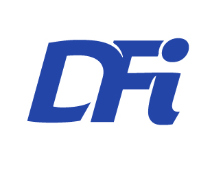

This is one of the hardest kinds of projects, and clients rarely realize how much time goes into making something look the same but different. I am troubled mostly by the shape of the D, the thin-ness of the top and bottom curves and the somewhat arbitrary counter space. Logically you seem to be relating it to the widths of the horizontal strokes on the F, but to me it feels weak, and it is the starting letter, so I think it should "break the rules" about proportion, and have more weight and possibly less curve in the upper left hand corner where it joins the stem.
I don't know about the others, but I like the direction this is going!
This is more harmonious, the other one with the spikey/straight "i" is more aggressive. Like you have said, the client will have to decide which impression they want the logo to make.
Looking at your latest version, did you try to pull the upper point on the end of the "i" upwards a bit more, so as to echo the upwards motion/direction in the "D"? Something like this –
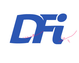
i will begin this post, to thanks you all for your comments and ideas, this is the most exciting experience i ever had, since i mostly work alone.
@spark: hello there, so if i understand - with the help of google translate - you think that i should make the beginning of the D more square and the upper part and down part of the D more bold ? For white space and counter white space things, i admit it, i'm not the best at that - the fault at the fact i never did Art School and learn everthing by myself. I will try to put the logo on a grid, it may help me, because i mostly only work with what my eyes say.
@altaira. glad you like it :) , i will try to hook up the end of the i, but i don't think i will have time until tomorow or late this night.
okay, 2 new version, with the new i (one is slightly shorter than the other, i mean the end of the i)
as suggested by spark, but i'm not sure i understand well, i make the begining of the D more square, boldify the top and the bottom of the D (on the first one) but i think i like it more before.
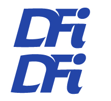
I personally think your new top version of the D is much stronger. I like the thicker strokes and more square beginning, and the smaller white gap at the bottom.I have mixed feelings about the curving endings on the horizontal strokes of F--they are more integrated, creating a rhythm of white spaces, but they are also a little bit "tricky" or busy, and I'm not sure how well they will reproduce at tiny sizes. You might reduce this to its very smallest size and check that it still works. I definitely prefer the i you have in your last version, curving up at the end.
had a little spare coffee time this morning so had a bit of a sketch

just throwing some stuff in the mix ... this would need work to make it work at smaller sizes.
----------
Paul Ducco
Graphic Designer - Melbourne
have you thought about changing the colour slightly?
maybe a darker or richer colour and slight ajustments like taking the dot out of the "I"
This thread gives "design by committee" a whole new spin...
not really. I don't think the brief is being/has been diluted.
it's more like a type of brainstorming but then ... I guess it's all about how you look at it.
----------
Paul Ducco
Graphic Designer - Melbourne

Maybe you could attach the dot of the i to the F wholesale, and then differentiate it with some subtle 3D or colouring effects. Maybe make it an empty circle.
Thanks everybody for this huge group brainstorming. I'm looking for a way to enhance the dot of the i but basically now the project is in the hands of my clients who will choose what to prensent to the big boss. I have no web site right now - i publish some of my work in logopond - i'm working on it, and i will make a special page to explain the particular process of this logo and mention all of you in here and this forum. If you want i use your full name instead of your screen name, mail me at thierry(at)lefty(dot)ch
i may post an article on a swiss-french web site who is more specialised on web 2.0 work/strategy but could be interested by the "2.0" process (www.professionweb.ch) , and again for people who wish, i can name them at the end of the article, just tell me by mail.
Thanks again for your enthusiasm to help on this project. Of course i will post the chosen result here, but it could take some weeks before the boss decide about a version, they are very slow on some thing, and - like every client i guess - then they want everything for yesterday after.
best regards, everybody
thierry hefti
@spark: more i see the bolder D, more i find it better.
@Ratbaggy: thanks for your drawing, but i think the client will find it too much different globally, but as im still working on the i, I will try your suggestion for the dot.
Good luck Thierry.
I don't know about the others, but I think if you just mention Typophile being helpful, that would be a nice thing to do (and enough for me).
I agree with this previous post-- the Wiki effect, communal.But very thoughtful to offer direct links.
"I don’t know about the others, but I think if you just mention Typophile being helpful, that would be a nice thing to do (and enough for me)."
Ok, so i just mention typophile with a link to the site if that's ok with everybody.
I'm going to make a font for DFi - this is my first one - based on product logo i did for them previously
So maybe we will cross road again in the font section.
_||//
hi everybody,
just a post to tell you that DFi choose this version of the logo
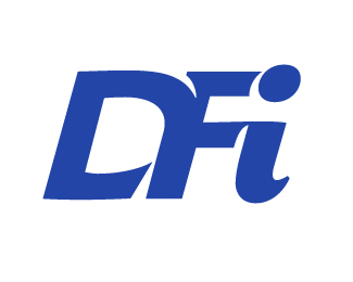
The reason why they didn't choose the cutted version of the 'i' is that non-designer people feel that it's missing a part and they
prefer the 'jumpy' 'i' because it's more simpathetic. I'm still working on the logo, fine tuning the width of the F and the way the F interact with the dot of the 'i'.
The rejected projects:
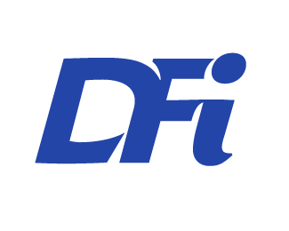
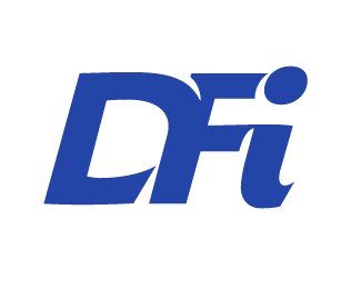
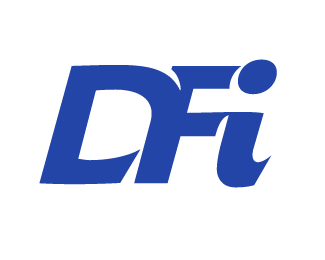
well there you go.
----------
Paul Ducco
Graphic Designer - Melbourne
They chose well.
___________
Robert Koritnik
Captured from web.archive.org on 18 Oct 2014. view this capture