
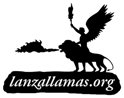
I developed the logo for a publisher. I had some trouble solving the feet of the angel.
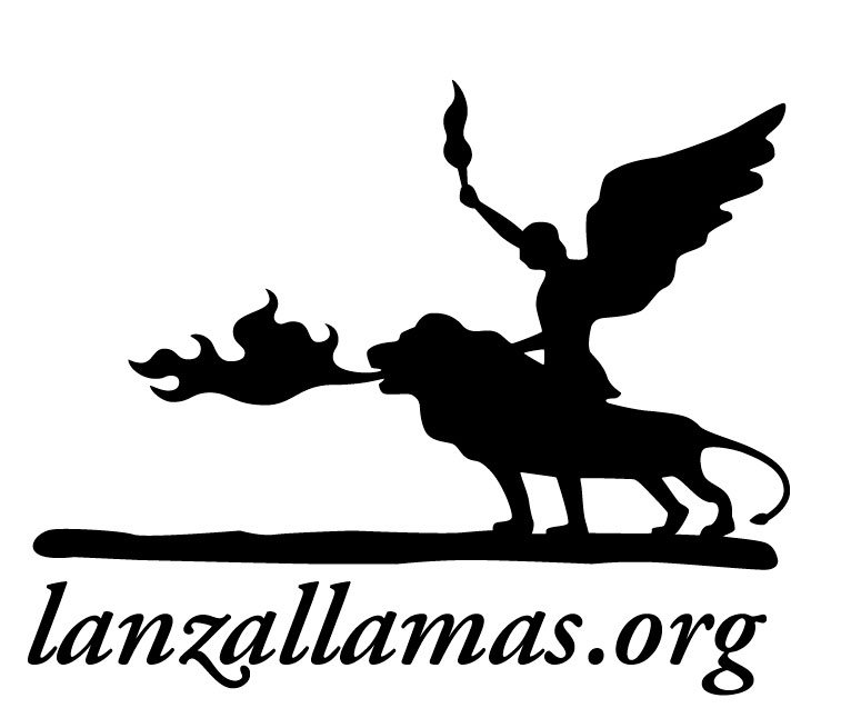
I developed the logo for a publisher. I had some trouble solving the feet of the angel.

The fire breath reminds me a bit of a flame decal. Can you show us some other variations?
Right now the angel looks somewhat somber to me. I'm not an artist, but if you were to make him look more heroic I believe you would have a more impactful design.
Lastly I think the type treatment could use a bit of work. I don't have any specific font suggestions but I think it text would look better with a larger x-height and increased spacing.

I thought I knew my Bible stories pretty well, but I'm drawing a blank on the angel with the fire-breathing lion. What's the story behind this image?
Like Zev, I'm not an illustrator, but I think the placement of the angel makes it ambiguous whether he's riding the lion or standing next to it. Also, if you refine the shape of the lion's forelegs, it will be more obvious that they don't belong to the angel.
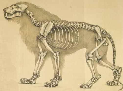
You may find some good ideas here jko:
http://istockphoto.com/file_search.php?action=file&text=silhouette+lion
http://istockphoto.com/file_search.php?action=file&text=silhouette+flame
http://istockphoto.com/file_search.php?action=file&text=silhouette+wings
http://istockphoto.com/file_search.php?action=file&text=silhouette+angel
guau! thanks, I'll soon post new versions.
More heroic, that's the spirit.
The image of the lion is amazing and enlightening.
_______________________________________________________________

mojo that image is freakin HOT!
know what the source was?
angel? riding lion? walking next to lion? holding torch? wtf!?
honestly it looks like you've grabbed a couple of different images through goggle smashed em together and traced em (badly.)
I'm also curious as to why a publisher (I'm presume of the printed variety) would use a domain name in their 'logo'.
----------
Paul Ducco
Graphic Designer - Melbourne
Paul, What is the idea of putting this kind of comments here? Is it so that people step out of these places?
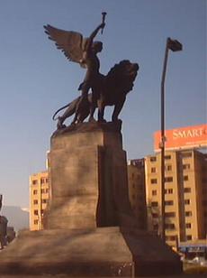
"El Angel y el Leon" (the angel and the lion) is the name of a Roberto Negri´s sculpture located in Santiago de Chile. It was a gift from Italy to Chile for the celebration of its independence. It is not an invention, it is a sculpture, the drawing it is based on a photography of it.http://www.flickr.com/photos/escatologia/3461527828/sizes/o/
If it is badly drawn is because it´s in development, and that is why it is posted here, so other people can comment what is right or wrong about it. These way I can improve it.
The idea of using .org in the logo is because more than a publishing company (that publishes books) it is a independent colective of cultural spreading, that remarks it´s inspiration as a independent Organization, more than a commercial one. Besides it´s a webzine and also a independent publishing company, so is more important to remark the domain (URL).
I will appreciate in the near future that the comments were a little bit more constructive and thoughtful, is a bit violent to receive non constructive critics and only disparaging or malicious ones.
Some really important. Lanzallamas means Flamethrower, the name of a book of Roberto Arlt.
jko | Santiago de Chile
I found the 1860 lion drawing at this URL. There's a list of links and references at the bottom of that page, if you want to know more.
Thank you for introducing me to Negri's sculpture.
jko - what do you mean? did you take offence to something I posted?
If you'd said - this is a very bare bones WIP of an initial idea for a logo for an independent webzine publishing collective - with a focus on cultural
communication. Then you'd probably have got more 'constructive' feedback. Without sounding too harsh, I'll comment on what I see and how I see it, based on the information provided.
Continuing ... I don't think the flames are necessary. The sculpture is fantastic and can really work as the logo ... I just think it needs a lot more work on composition and execution. It's not reading well (if at all).
Don't take it the wrong way. We're here to help.
----------
Paul Ducco
Graphic Designer - Melbourne

Check out the number of legs...I see one front paw, two angel legs, and two hind paws. Although the angel's rear leg looks a lot like the lion's...maybe it is the lion's? Very confusing.
Also, the area where the angel's robe/dress/tunic touches the lion's back creates a weird shape, I think.
Overall, I think there's a distracting imbalance of negative and "positive" space. Personally, while I agree that the first flame looks like a car decal, I like it better than the newest version, which looked to me like a duck trying to escape the lion's mouth.
Have you played around with the direction at all? Flipped the image horizontally so that the lion/angel are facing to the right?
-Scott

I would definitely look at redrawing with focus on anatomy of people and lions, rather than working from a photo of a statue. As Ratty said, the execution is lacking.
Ross

Hmm, interesting.
I like the ambiguity about whose legs are whose. I also like the way you've got five legs. On first glance most people wouldn't notice that's an odd number. To me it looks unmistakeably like the angel is walking, and not riding the lion.
I would however add some sharpness to the contours, it seems a lot of the corners are too round, clean and smooth. I think some polishing of the silhouettes to get them closer to anatomical would be very worthwhile.
I'm not sure about the way the fire on the lion's mouth is shaped.
And I'd flip it to face right.
Hi jko,
I think your legs arrangement is quite good. More than five legs would be a mess. If you want more suggestions, I have two:
1. I find the ground baseline a bit too heavy. Have you tried something thinner?
2. There is something weird about the angel's torch. It doesn't seem to follow the same rules as the lion's flame.
3. (I said i had two suggestions, but...) I find it a bit too complex for a logo. Have you already started checking it in small sizes?
Inspired star anyway. Keep working!!
Yago

Hi jko,
I think this can turn out nicely, it´s an interesting image. But I think there´s a bit too much going on in this logo, too much flames and legs. I would try and find a more dynamic view of the lion and the angel - maybe something like the picture of the statue posted by Mojo would work. Actually I think it would. And I would skip the ground, or incorporate it with the text (making the ground a black box with white text in it). I also would skip the flames. If needed because of the name, stick to one flame - coming from the lion, disconnected from its mouth...

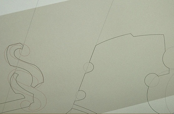
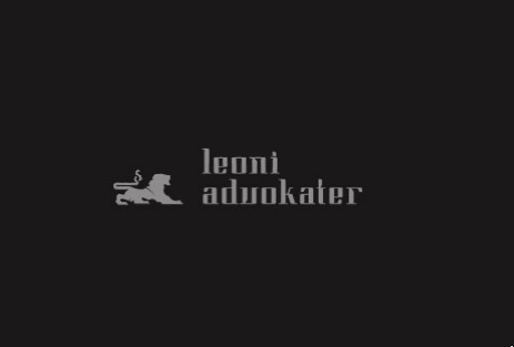
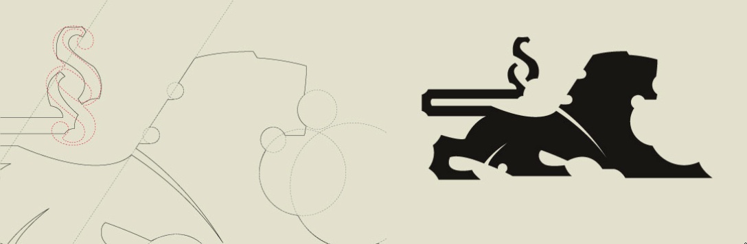
Not saying this sort of geometric designi is the direction you should take. But its kinda easier with real examples.
I'd like to see this sort of iconization (if thats even a word) or simplification on the work you're doing. Its got potencial.
Good luck
Ps: This is a work by Hello Monday
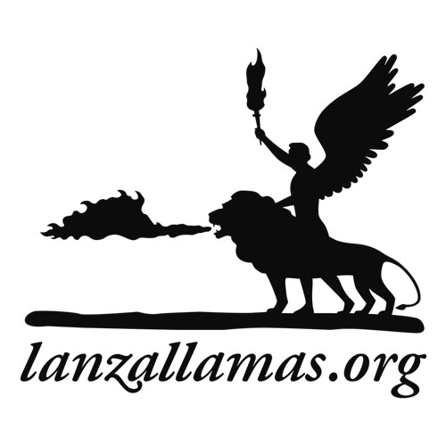
hey thanks for all the comments!
I followed the idea of entirely redrawing the shapes and I have come to this solution, which I think is significantly better.
_______________________________________________________________
jko | www.sindicatodelaimagen.org/cft/blog | www.latinotype.com
oh and you got over being offended? :-P
it looks LOADS better.
DavM - that is HOTNESS!
I too reckon it should take an aesthetic approach like the one posted.
----------
Paul Ducco
Graphic Designer - Melbourne

Jko, this is coming along very nicely.
Personally, I would loose the flames coming from the lion and the wobbly ground the statue stands on. I reckon they simply distract from the overall beauty of the mark. Plus, you should really work on the type treatment and its relationship to the mark.

You could allow the ground to stay rough on the upper edge, but make it nice & flat underneath so it doesn't make distracting ‘wobbly' shapes above the text.
________________________________________________
Ever since I chose to block pop-ups, my toaster's stopped working.
Wow!!
This is a very interesting work in progress.
I agree with all about seb. The image is quite complex, and giving away some elements would help readability and pregnancy. Besides, the flames, although very well drawn so far, seem to be a bit too realistic compared with the rest. Also, removing the ground is something you should definitely try: legs+text should be enough to hold both figures.
What about making the ground thicker and placing white text over it?
Also I think the wings would look better with pointier feathers.
Finally the lion's flames don't really fit with the rest of the image.

How about making the type be the flames?
Yes, I was also going to say pointier feathers...looks good. It's a very detailed logo now. I wonder if there's too much going on?

too much detail & off balance imo.
Feel like drawing this morning...so here is a quickie...hope you don't mind.
I based the illustration off one of the photo above. It still can be simplify even more imo. But anyway, I tried to give it a more stylize & dynamic approach.
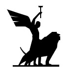
I like your lion Jake. (Although the tail seems to have a boner)
some of the focal/action arcs need work (IMO) but jake's quickie is a great alternative.
the flames certainly don't help from a compositional point of view.
----------
Paul Ducco
Graphic Designer - Melbourne
I like that draft jakes.
Even tho its just a quickie it doesn't resemble a lion anymore and it should not loose that.
Well but that'd be just a small tweak on the face and it'd be solved anyway.
ok unlike jakes, i'm too busy (haha--just kiddin) to do real work. too lazy. but he showed in his drawing what i was going to suggest, and that is to create a more symmetric structure by using the angles to your advantage. it would look more dynamic as well, if you sort of following the two axis of a letter x (more or less of course. also, as jakes shows, you absolutely need the head to be separated from the arm.
anyways, the red lines show a rough axis to be used. and since i didn't do the work, i would imagine the lion would need to posture up a little bit, stand a little higher at the shoulder, and bring the butt down--again jakes you nailed it. haha. i might as well just be explaining what you did
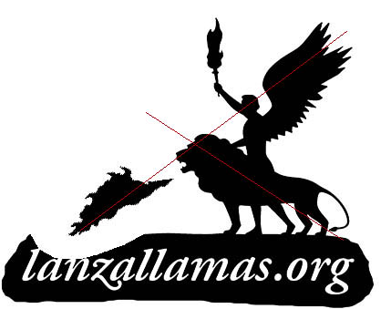
Excelent, you give me a lot to do! Thank you all.
The jakes drawn is very nice, and the evanbrog explanation gave me some ideas.
The all-about-seb comment is a good idea, i'll try to do it.
Paul, we are ok. :)

So far I've been quiet. But can't be any more.
I'm sorry to say that I don't like this logo at all. It's going in the wrong direction, it's clipart and not a logo.
WHat jakes did was at least something you could build on. Existing logo has waaaay too much detail, various shape style and as said. Not a logo in itself.
There are lots of great logos with lions around the world, and when you try to produce another one, make sure it works in small sizes as well. This one doesn't. You got distracted by reality.
Let me show you one of the very nice lion stylisations around that can give you a hint.
http://www.stol.si (never mind outdated website, but logo is plain fab)
Jakes' logo did lack lion figure stylisation and too rigid torch, but it had dynamics.
As far as I can say this existing logo is facing the wrong way if nothing else. Unless you live in a Right2Left reading country. It's moving to the left, looks left and that is wrong already. It goes back to past and downgrades business instead of growing and future's_looking_bright logo...
___________
Robert Koritnik
I only skimmed this thread but wanted to throw my 2¢ in. Hopefully I don't say something some else already has. One thing, and it may only be me, but the fact the angel and lion are facing "backwards" and towards the "past" is somewhat bothering me. Then again, perhaps it's a good thing seeing as how the myth is from the past. Just wanted to point out that I responded to that subtle detail. I think the foundation could look a little more "stable" and less loose. It looks as though it is falling apart.
jko – Good luck and I look forward to seeing future refinements.
I must apologize JKO. I was a bit harsh with you without giving you any positive feedback. I can see you want to make this logo work. I just wanted to say that the path you're taking is not the right one.
I'm still very ken to see where this will get...
___________
Robert Koritnik
Don't worry Robert (and Paul). My basic level of English confuse me, and sometimes I read things harder than they are.
I'm from Chile and speak spanish...
About the angel and lion, it's true. Now is like a clipart, with a very tense position and a extrange composition.
I'll follow the advice to give more emphasis to heroism... and maybe remove the flame. :)
_______________________________________________________________
jko | www.sindicatodelaimagen.org/cft/blog | www.latinotype.com
JAJA. Paul, in chile the tapas don't even exist. This is really southern, penguins and ñandúes. Maybe a chorrillana from valparaíso http://www.flickr.com/photos/ilo_oli/2599344086/.
_______________________________________________________________
jko | www.sindicatodelaimagen.org/cft/blog | www.latinotype.com
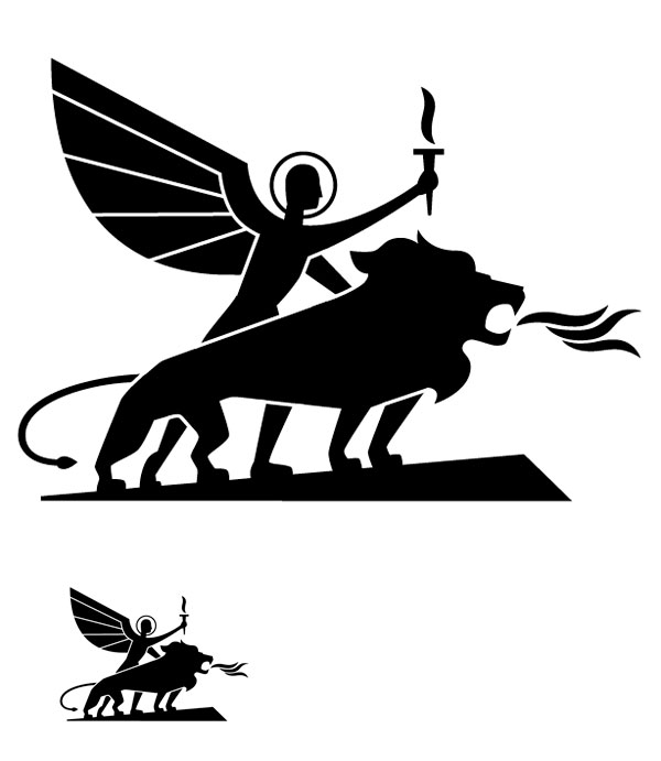
New version,more stylish and clean.
After one hundred drafts, and some Eric Gill style.
And without letters
jko
That's hot!
Only thing I'm not loving is the halo.
Also you might want to remove the white line on the lion's front leg.
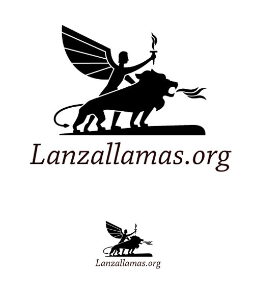
everything but the fire...
jko.
fantastic!
This is a fantastic improvement, well done.
Some thoughts:
- keep the white line on the front leg - it created a nice depth
- consider changing the angel's neck & lion's tail (maybe it is just the angle?)
- type still needs some work, it feels added on, not part of the overall design
Great work. Wow!
The new flames rock, too.
I agree with Seb about keeping the white line on the front leg, but maybe the tail doesn't need one?
And I agree that the angel's neck looks stiff.
About the type: I think the cap "L" sticks out too much.
Spontaneous thought, maybe you can find an italic whose slant angle (optically) matches the leg of the angel that's just above that double "l" now? That might be neat.
Really good improvement.
I'd suggest that the angel looks a little as though he's struggling up a hill, whereas in the photo of the monument he appears to be standing taller.
Ross

Wow, the new ones look really good. I agree with Altaira about the angle of the angel's neck.
I also like how the style of the lion's fire matches the torch.
I would angle the tip of the tail down and to the right slightly, to sort of fill (not completely) some of the negative space at the lion's ankle. Right now it is pointing directly at the leg. If you angle it down and to the right more, it will "point" to the words, helping to draw the eye down to the words.
____________________________
www.coroflot.com/kate_dawson
Jko Hello, I think the new angel q even is not consistent with Leon in his style, the angel is very clean but the Leon have many details, are required to futurism Leon
saludos

Lion's front legs, and maybe angel's head, look a little spindly to me.
Much improvement!
Angel's neck...looks too long. I also agree with Luciano...the angel's wing doesn't match the rest of the style.
I think another problem with the neck is that it appears to be disconnected from the spine.
Ross
The Angel really needs to STAND in a correct posture.
Also, as someone said, the wings are a bit too geometric, they don't fit the style of the rest of the elements.
Keep working, the logo is making progress :)
I think maybe it doesn't need the angel's lower arm and its head looks a bit funny. And the lion's hips look a bit small and low? But I like the lion's head and angel's wing.

This thread has been a good read. The logo looks much better now, than it did at the beginning. I'll echo everyone else's remaining criticisms and add that, to me the lion's body seems a bit long. I also would prefer a more iconic style. The one posted earlier on by DavM is fantastic. AyA is one our clients, and I've always liked the way their logo feels like a statue without being overly detailed. I wish a had a better picture of it; I think the drop shadow used on the website is distracting.
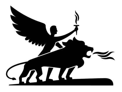
Hello and thank you all.
I think I'm really close to the final Angel & Lion, with all the help of you guys.
I've learned a lot.
I make some changes to the flames, the hair, the neck, the wings (off course), the tail and the lion's hips.
I don't want a geometric result, then I've draw the wings more organic
when I finish the drawing, i'll start with the word...
First. These wings are better but I think they do have too many tips. Change the size of the logo and you'll see that some of these will become problematic. So less detail.
Second. End of angel belly and start of the front leg is just about visible above the lion's back. Remove it.
Third. Did you try tilting the torch a bit to the right and flame a bit to the left giving a feeling of movement.
I think much could still be done with lion's head... Otherwise this is a logo that can actually get somewhere. Very well evolved.
___________
Robert Koritnik
What about getting rid of the left arm? I think that might simplify things.
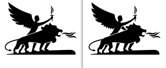
The left one is the new.
Litera: I rid off the wing, now looks better on small sizes. And i've make the small details that you've advised
ZEV: Without the left arm it's more clear, but this modifies a little bit the posture of the angel.
if you have to keep the arm there - I don't think it's needed - then you should consider revising the 'stacking order' you've currently got it in/at. He's holding the lion with his furthest arm but standing on the far side?
I also don't know that the curved line styles are assisting at this point ... the basic structure and proportions aren't there yet.
(just my opinion)
why not show some of the sketches you did before vectoring the illustration?
----------
Paul Ducco
Graphic Designer - Melbourne
Looking much better with just one arm.
Without the arm is really better. I am quite convinced with this version.
Paul the sketches are really worse that this version.
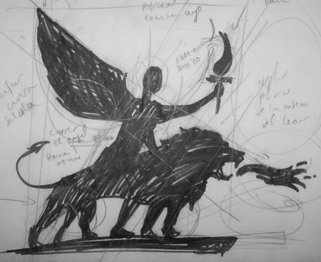
Maybe the size of the angel can be corrected, and the tail.
Jko, let me first say this shows some nice progress...
Further my comment is that your drawn version is much better than your verctorization. Only some detials such as the angels head and lions should be explored more by drawing. But the drawing is still more powerful. For example the way the angels backleg stands (on his toes) is very different than the vector.
Last thing, but this is more a question: Do you really need the strange ground the statue is standing on? Or if you do, maybe explore different shapes?
Good luck!
I think the proportions and postures of the sketch are better than the vector.
Oh yes. Lion's head much better on the sketch.
I was also asking myself of lions tail facing downwards/inwards as a sign of fear. Animals usually put it upwards when powerful/dominant. So your sketch has a different version here.
And I'd still ike to see the torch tilt and flame change to see the movement.
___________
Robert Koritnik

@Ed_Aranda: +1
There is a lot of progress since the first post. Illustration logo are very hard thing - if you're not an illustrator or specialist.
The other way is stylise more or less like DavM suggest it (very nice work from Hello Monday)
The last vector version the lion body seem too long.
I don't know about lions, but dogs put tail downwards as sign of submission. i think the tail is bettet up.
keep working your comming closer to someting very nice.

Yeah, the length of the lion's torso really stands out. The mouth also looks somewhat like a beak. I guess I'm just reiterating what everyone has said, but that's what I thought before reading them too. Having a tail up looks more aggressive and therefore appropriate, and the neater mane in the sketch is also nicer.
Captured from web.archive.org on 16 Aug 2013. view this capture