

.
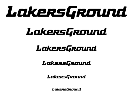
Does anyone read it as LakersGroWnd? (should say LakersGround).
If so, this is one possible solution...

Also does the spacing between the characters look right?
Thanks
.
Does anyone read it as LakersGroWnd? (should say LakersGround).
If so, this is one possible solution...
Also does the spacing between the characters look right?
Thanks

I vote no on the un ligature. Also, the La is problematic. Considers shortening the L and kerning a tad more. Possibly raising up the serif to match the G (might stop readign as an L). Otherwise, looks ok to me. Perhaps a tad soft...Looks like it got a stroke our outline?

Zev, did you blur the letters purposely? Or?
Zev, did you blur the letters purposely? Or?
I did, but I'm thinking now it might not be the best choice.
I'll see about making a sharper edged version.

It says "LakersGround" to me.
The spaces after "L" and "G" are quite distracting. In fact, the large version almost looks like "L Akers G Round". Try kerning them closer, but I suspect that you'll have to connect them as you did with the rest of the letters.
The descender on the "G" may be aggravating the disturbance by breaking up the line.

IMHO,
More space is needed between the two words. La is too far apart, and L is a tad too small. I would try enlarging the L and dropping it beneath the a, pulling it much closer - kinda like this, but much less messy:

I think my dirty example here shows the L too big, but you get the idea. I'm not convinced it works much better, but I still think the L you have is problematic.
cool. I hadn't seen anyone use Fuel Script before, and using it for something Lakers-related makes it twice as intriguing.
Thanks for the suggestions guys. I realize now that this script style might not be the best solution for the problem.
(I still may find use for the design on a T-Shirt or something.)
.
.
Here's a sharper version...

.
.
>>>>> cool. I hadn’t seen anyone use Fuel Script before, and using it for something Lakers-related makes it twice as intriguing.
Yup, It's one of the coolest typefaces I've seen. You and your partner did I great job. I hope my design did it some justice. (I swear it was nothing personal that I squeezed it, removed the inktraps and blurred it to death ;)
So your a Lakers fan? That's awesome. I do most of the graphics and design (although we haven't updated in a long time) on LakersGround.net, though I'm not a pro like you.
I designed the logo you see there a while back. Everyone seems to like it but I'm getting bored of staring at it all day every day. Thus this thread and possibly additional ones. =)
.
.
BTW here's a sexy photoshopped version of the logo for those that are bored.
all good Zev. Should be an interesting game tonight. good luck with the logo.
Captured from web.archive.org on 19 Apr 2015. view this capture
