
Who said moiré was bad? Nope—it’s fun fun fun!
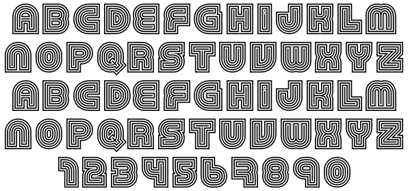
This font, 79, by—I have no clue—is just okay. Not TDC material, I know, but it does have a purpose.
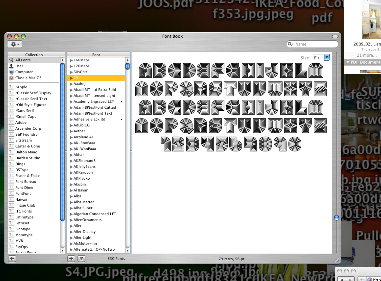
But look at what OS X Exposé can do to it.
Groovy gradient patterns within the letters.
Mikey :-)
Who said moiré was bad? Nope—it’s fun fun fun!
This font, 79, by—I have no clue—is just okay. Not TDC material, I know, but it does have a purpose.
But look at what OS X Exposé can do to it.
Groovy gradient patterns within the letters.
Mikey :-)

This is because it was designed to be used at a certain size. On screen and with low resolution, lines start crashing together when the size is to small. (Exposé zooms out even more with its transitions)
Yes.
Captured from web.archive.org on 6 Aug 2010. view this capture