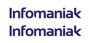
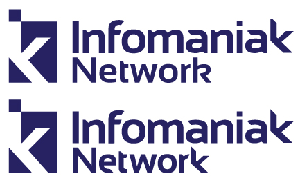
infomaniak means computermaniac in english wich name is not related on their services (10 years ago their were fixing PC, so is their name). in french "maniac" is writtent with a 'c' not a 'k', so i decided on this project to focus on the k to get an identity.
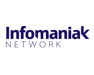
i made the first logo based on a Myriad Typeface, wich i modified to make it more personal, but i'm asking myself if enven with modifications, myriad is so much used, that it's hard with this font to have a personal touch signature logo.
So if you could help me decide in this series wich one is the best, what do you like or not.
dont hesitate to be crude if think so, i'm not afraid of the dark, and you can learn a lot from critisism.
ps. sorry for my bad english.
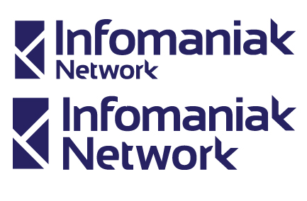
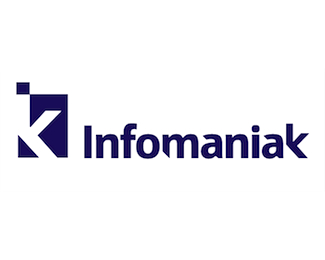
first three have the same typo, just added a logo for project 2 (and a 'trying to be fancy' gradiant in 2b)
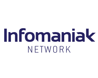
Project 3 is different typefont.
| Attachment | Size |
|---|---|
| infomaniak.jpg | 21.09 KB |
| infomaniak2.jpg | 25.01 KB |
| infomaniak2b.jpg | 31.21 KB |
| infomaniak3.jpg | 21.01 KB |