
A recurring topic that Eben Sorkin has been bringing up is the variation of letters within body text faces, something that today doesn't seem to happen as much.
While I was working to put in the ligatureless ligatures, I also started playing around with some other variants. In my Coruña, the f and j have extremely long descenders that can occasionally collide or can make a space look like it's not really a space. Kerning almost always looks wrong, so in these cases, the letters automatically close up into a more compact form.
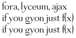
In the above example, the first line shows words where the long ascender/descender of the f, y, and j don't get in the way. The second line they clearly do, and the third line compacts them.
What are some other subtle substitutions y'all've seen either in older fonts or modern digital ones?

