About the Company:
Simplicious is improving the usability of software-applications and websites. Their goal is to design efficient and effective software to improve the user experience.
The idea is to keep it simple on the one hand and to keep a certain beauty in mind on the other hand.
Simplicious: Simply good, simply delectable, simply delicious. Like salt, use it sparingly to add a twinge of spice and sophistication to any conversation. (Urban Dictonary)
Concept behind the logo:
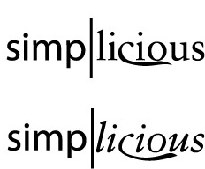
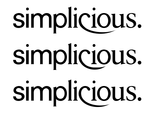
Throughout the whole logo the type gets a transformation from univers 55 to sabon roman. Univers with it's straight lines and the exceptional legibility represents the "simple"-factor. Sabon which looks like it has been designed with a wide-nib ink pen represents the "delicious"-factor.
In addition to make these two fonts work together, the x-height of the sabon has been adjusted. Only the first and the last "s" are set in their original typeface. All the rest has been done in FontLab Studio to create this illusion of morphing.
I am really looking forward to reading your suggestions on it. (font-selection? typeface? kerning? appearance of the characters themeselves? ...)
I would also appreciate your opinions on the company-name itself in connection with the branch. Is it a good idea to concentrate on typography to give it this touch of seriousness or might most of the people don't recognize the typographic effect and only be confused caused by the inconsistence of the logo?
| Attachment | Size |
|---|---|
| simplicious.png | 3.1 KB |