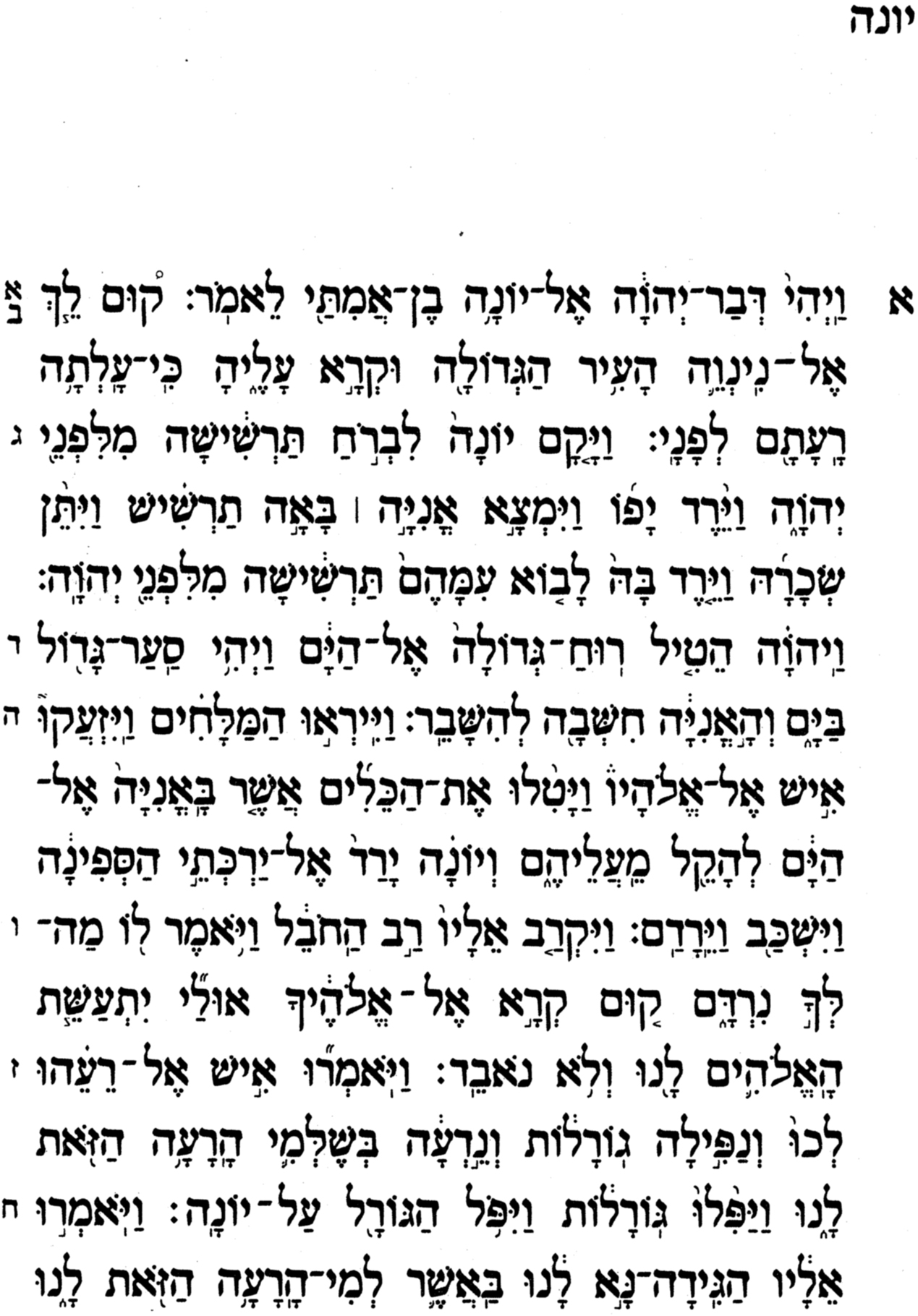
Many have tried and failed to merge Hebrew into English, or vice versa, on the font design level.
After all, a Semetic typeface stresses horizontal scribe-like strokes, and a European style typefac stresses vertical cut metal-like bars. So, how can they be merged successfully.
Gill tried and failed with each experimentation. Others also fell by the wayside.
Finally, Boruch Gorkin (Monotype licensor to MicroSoft and Apple licencees), a brilliant designer in Manhattan of Russian descent (see www,boruchgorkin.com) succeded in part to make a Hebrew version of Monotype's Ariel (weatch out for those Russians).
But Ariel was a sans serif with almost the same stroke widths horizontal and vertical. He based his design upon Tzvi Narkiss' popular Narkiss design, adjusting its stroke width a bit, and height to sit between the x-height of the English lowercase and the top of the English uppercase, and improved upon a bit of Narkiss' design.
But could anyone make a merger in a serif design for Hebrew with varying widths for the horizontal and vertical strokes, and match the overall color of the page in either language?
This blog shows how.