
The image has been scaled down sample to fit this page.
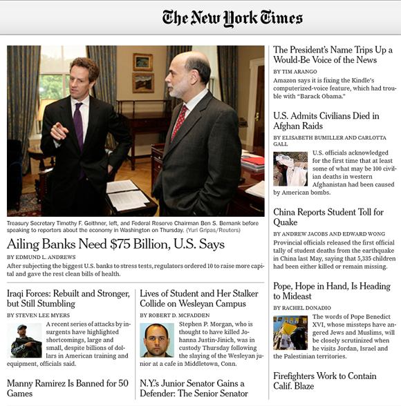
Adobe and The New York Times recently announced the Times Reader. The Adobe AIR desktop application is well designed and stays true to the New York Times brand, largely owing to the reinforcing quality of the Time's custom typeface.
This is web content. It's web content that is neatly poured into a desktop application. Why is this news? It shouldn't be, except that somewhere back in pre-history when the browser was being forged in the fires of mount Doom it made sense to render content with fonts installed on the client device, not native to the server where the files were hosted. (Sure, it also makes practical sense where 14.4 modems are concerned, even if it seems like an evil plot to control the races of middle earth.)
That was then. But why are we still stuck with a lack of web type options? We hear about technologies but aren't sure about implementing them. Font makers licensing agreements are only part of this equation but it's time for them to recognize their culpability -- even if it's not solely their problem. It's also time for digital designers to embrace font embedding technologies and show that they're willing to buy licenses for embedding quality fonts. Every major brand understands the connection between type and brand identity. It's time to embrace technologies that will let fonts have a rich and pervasive digital presence. It's time to sell type to designers and brands, and not to every single reader, viewer, and consumer.
Can you imagine if ESPN had to display sports tickers in the fonts natively installed on your television? Absurd. But that's what may happen when you start seeing Facebook and YouTube television widgets. (It's true, you can buy these TVs today from Panasonic or Samsung.) One of the promises of Adobe's Open Screen Project allows designers and brands to embed type into applications and widgets across devices: desktop, mobile, and TV. The foundries who already allow Flash embedding (which is increasingly permitted by many foundries) will win here.
Typography is a means for brands like the New York Times to hold onto an identity that is tied to a rich history in printed media, a media that is becoming harder for them to justify. And yet, as they move increasingly to digital channels they have to find ways beyond the browser to reinforce their brand identity. Isn't this obvious? It was back in 1996 when I started my career making web pages and cutting up hundreds, thousands of little GIFs. But somehow under the numbing weight of Sauron's browser we all grew apathetic. "Fonts are for print guys" or "I need a font when I design a logo." If you are lucky you get a client who will let you use sIFR because the days of all-Flash sites are dwindling. We saw the power of designing for machine-readability which good search engine optimization demands and gave up on GIFs (and at some point our souls).
The broader context and opportunity for designers, is creating digital experiences beyond the browser. Thinking beyond the browser extends to the desktop PC to handheld mobile devices, televisions, in-car experiences, etc. One of the gaps here is type.
The AIR app side-steps the browser discussion, but it underpins a much bigger discussion that is yet to happen on a broad scale in the design community. Designing for internet content that lives outside the browser will become a major discussion among web and branding firms in 2010. It's already a major discussion happening among consumer device UI companies like Punchcut and in foundries focused on device type like Ascender and Monotype. Questions about brand identity and user experience consistency naturally surface when content and functionality get poured onto TVs, desktops and handheld devices.
I have to finish with a more personal note. Many of my friends and digital acquaintances are type designers. Many of them are graphic designers who pursue this passion on the side. Fewer of them make a real living solely from font sales and I have sympathy for their business when I write this. It's simply the basic economics of demand. A web that is friendly to font embedding, and designers that embrace font embedding, will create demand for embedded type that will help type designers flourish.
____
For more about the Times Reader check out the video interview with Adobe's Jeremy Clark, "Ahead of the Times" on Adobe's Inspire publication discussing the user experience design thinking behind the app. Also on Inspire is "Reading the Paper with Khoi Vinh". Mr. Vinh is the New York Times' Design Director and the blogger behind one of my favorite design blogs Subtraction.


