
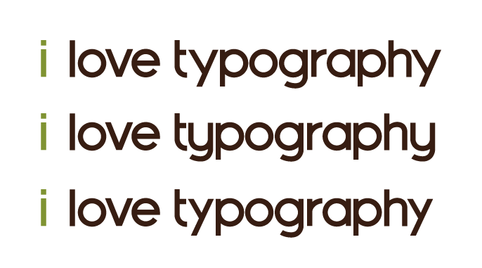
I've been working on my first typeface and I'm trying to decide on the right lowercase 'y'.
Thoughts?
I've been working on my first typeface and I'm trying to decide on the right lowercase 'y'.
Thoughts?
and some other characters:


The second version works nicely with the t and g but I think the first version would be more normal. I'd actually suggest making the left arm slightly slightly steeper and the join down slightly below the baseline I think.
You might need to thin the joins on the bowl and stick letters.

I'd choose the middle one, It fit better with the rounded design of you typeface. Also the left oblique of the first and the third y should be on the baseline as the w is. It seems the weight of your typeface are unregular. Take a look at your w and the x the oblique are not the same thickness. Keep going.
Captured from web.archive.org on 14 Apr 2015. view this capture