
Clementhorpe is Greater Albion's latest project. It's based on some 'found' lettering (about a dozen letters in all) in an early 1900's enamel advertisment for chocolate. A sampling of work to date is shown below. All feedback greatfully received...
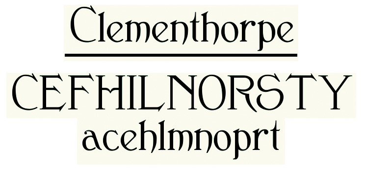
Clementhorpe is Greater Albion's latest project. It's based on some 'found' lettering (about a dozen letters in all) in an early 1900's enamel advertisment for chocolate. A sampling of work to date is shown below. All feedback greatfully received...
I think a lot of the forms are very appealing, and I definitely think the style and feel of the original translates nicely.
My issues with it involve some of the vertical strokes, especially on the lowercase. A lot of them just seem too thick and weight the letter one way or the other, like with the "p." I'm also not a big fan of the "S," I think the upward bulge in the bottom curve is just a bit much.
These are the first impressions of a novice typophile, so take them for what they're worth. A well-executed revival, I say!
Here's the latest update on Clementhorpe-quite a bit of progress:


The LC z looks...awkward. And the quote marks need a bit more of the "hand-brushed" feel that you have going throughout the rest of the characters. I really like the leg of your UC R though. That's pretty!
Actually-the quote marks re a mistake-the actual ones aren't done yet and my proof document has added in default ones! On reflection I think know what you mean about the 'z'..... I'm still trying to decide what to do with that one. Thnks for the comments :)
Here's the latest progress on the Clementhorpe family:

or a more detailed set of previews of five faces can be found here.
Captured from web.archive.org on 17 Apr 2015. view this capture