Hello!
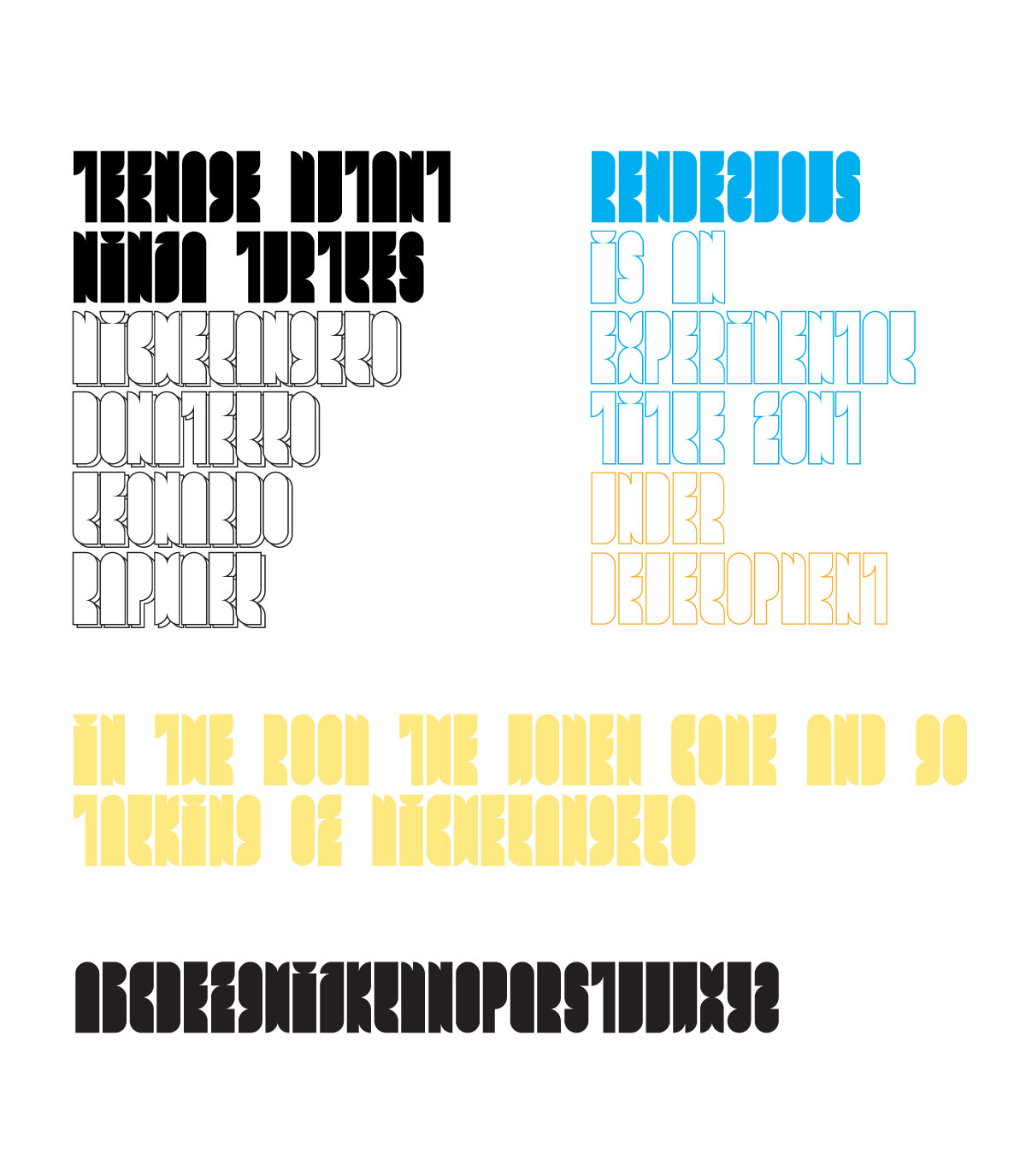
An experimental (for me at least) display type, only caps so far - i plan to add numerals and some more glyphs.
What do you think? How does it work?
| Attachment | Size |
|---|---|
| rendezvous_specimen_01_1200.jpg | 148.79 KB |
Hello!
An experimental (for me at least) display type, only caps so far - i plan to add numerals and some more glyphs.
What do you think? How does it work?
| Attachment | Size |
|---|---|
| rendezvous_specimen_01_1200.jpg | 148.79 KB |

Interesting! I quite like this :)
I think E and F need to be more divergent. And V and U. And I find L confusing.
I think AGOQSX need a little overshoot. And I'd think about making the Z have corners on the outside, rather than curves.
Keep going :)

The space-filling attempts of F and L are not working out. And at the same time you've got that skinny T whose negative space stands out far too much. I suggest you explore the potential of massive horizontal strokes; the appropriate area for these glyphs is currently represented by the P.
Thank you for comments - it will be much easier to go on with this design having such a great and detail comments&suggestions. I will update the preview some time later.
Thanks again!
Hello Typophile!
I've got some time to tweak my font design - not so perfect and no complete character set for now - just to show the progress.
What do you think about it?
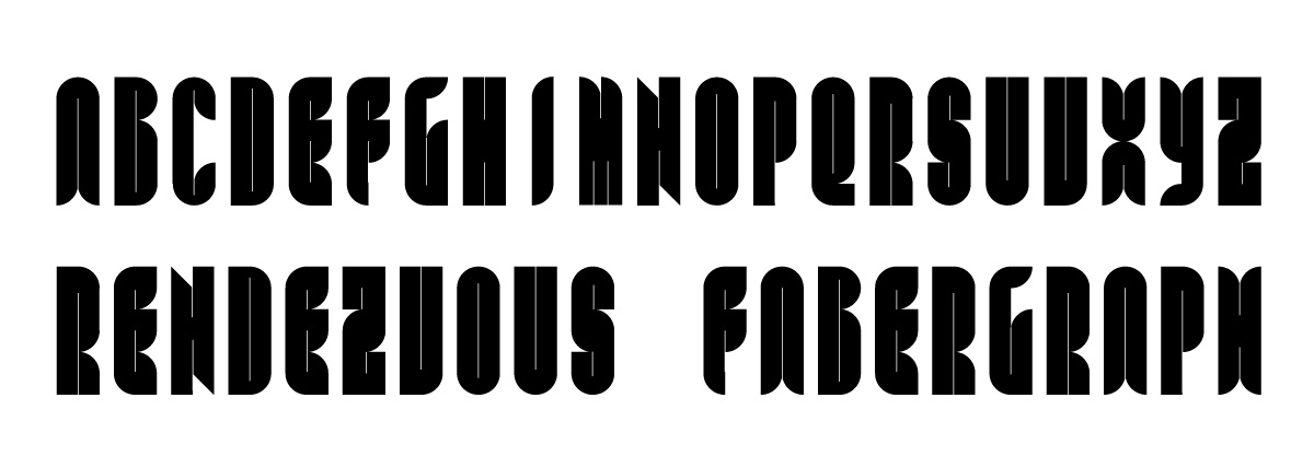
update on Rendezvous
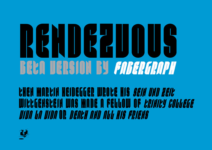
Groovy.
You may want to eliminate one of the slots in N to dispel its H-ness.
I also think that an all-solid version of the whole face with no slots would work with the shapes you have now (Though you might want the old H for that).
Thank you, cerulean!
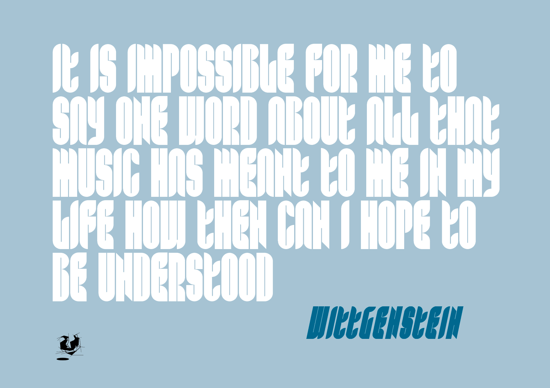
Some more update, tweaking shapes, accents, numerals and extended character set (not complete).
Captured from web.archive.org on 16 Apr 2015. view this capture