Typophile

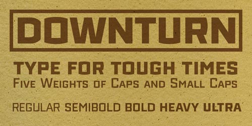
Downturn by James Puckett. Now with embedding-friendly license.

blank

Downturn was most directly inspired by letters painted on the wall of an old medical warehouse in Washington, D.C.. Other inspirations include lettering on manhole covers, metal signs and machinery in New York and DC.

Its quirky letterforms and deliberately uneven color reflect the typographic naiveté of signpainters and engineers more interested in impact than consistency. (That’s not a general dig at signpainters, just the typographically naive ones).

Chunky, in-your-face letters make Downturn appropriate for posters, packaging, headlines and other places you need a big impact.

Downturn is available for licensing at MyFonts—$25 per weight, $90 for the family. Web embedding licenses will be available at a later date.

Click here to download a PDF specimen.
Due to the current downturn, any discounts to the currently unemployed? Wink, wink... ;0)

Nice work, James!

Due to the current downturn, any discounts to the currently unemployed? Wink, wink... ;0)

I considered it, but then I remembered that I’m unemployed ;)

I like it James... the Ultra really shines!!!!!

Michael

Not only did you release a very fine typeface, but you also established a new foundry. I have much respect for your persiverance & endurance!

The foundry establishing still has lots of work to go. I have three governments worth of bureaucracy to deal with and a new web site to build. Good thing I’m unemployed!

Congrats and good luck!

Good on you! I was skeptical when you posted this on critique, but you pulled it off. Good Luck!

i hope downturn causes an upturn in your royalties checks! :^D

Already had a chance to use it on one of my websites: impoundloan.com

But yeah, congratulations! It's awesome.

In keeping with the tough times theme, I’ve discounted Downturn by 25% through Thursday. That’s $18.75 per weight or $67.50 for the family.

What is this? This is no good. How can you use this for?

Also, your image is 1-2 pixels off center. Please center.

Brown is no good to see the type. Only black & white. Please correct. thank you.

This is pretty cool. I particularly enjoyed the way the uneven "fatty" vertical lines look on smaller sizes. Good luck on your new foundry!

thank you.

What is this? No uppercase when starting a sentence? That is no good! Please correct.

I like it, only I think the small caps are a little to small. ;)
Keep up the good work!

Kind regards,
Martijn van Berkel

congrats james, all the best!

Good thing I’m unemployed!

Entrepreneurs are never unemployed.

I like it, only I think the small caps are a little to small. ;)

They actually are a little on the short side. That’s because Downturn is spaced very tightly on the assumption that it will primarily be used at larger sizes. The tight spacing made the small caps clash with the caps in too many places, so they had to come down a little.

Congrats, James! Best wishes for a bounty from self-employment :-)

ChrisL

I look forward to seeing this in the wild. I like the heaviest weight as well... In a way it could maybe go one notch heavier, although I don't know what you would call it.

Dowturn Blob

No, that doesn't fit Downturn, since no one gets fat in a recession. Except the Fat Cats holding us down.

I think it would be better if Ultra was just made super fatter, then graduate the sizes down the tree using the current naming.

So that makes two WPA/Depression inspired typefaces. You have anything else? Your version of Eagle is very cool, by the way.

Maybe Downturn Ursa for the bear market?

ChrisL

I think it would be better if Ultra was just made super fatter, then graduate the sizes down the tree using the current naming.

The superheavy versions are in the works. Expect one or two more weights and maybe a version with the counters removed.

You have anything else?

I’m trying to do something more upbeat. Although I have sketches for a downturn slab filed away for later…

And I have updated the license for Downturn; it now allows all forms of web embedding I could think of, including direct linking to the files.

Nice! (also as an aside, this is my first post from my new iPod touch :-)

>Entrepreneurs are never unemployed.

Like actors?

They are just between gigs.

ChrisL

Nice work James. I just purchased it to explore some ideas for a new identity. It fit nicely with the sketches I was doing. Thanks.

Belated congrats, James! (I gotta start visiting the Release forum more often!)

Like typerror, I too love the Ultra weight. Keep up the good work! May this lead to a steady stream of $$ coming your way!

Captured from web.archive.org on 15 Oct 2013. view this capture