
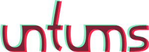
This is an interim logotype for my personal website, untu.ms. It used to include the dot from the address as well, but I couldn’t make it work, so I took it out. The word “untums” means “whimsy” in Latvian. I’d be very grateful for any critiques.

Well it’s certainly different - I really like your u’s and how they connect to the other letters - those shapes definitely have a sense of the whimsical about it. I’m not sold on the offset colors. It’s a touch disturbing and detracts from the whimsical mood. Just some thoughts.

Maybe you could “punch” the dot as a hole in the ’um’ connection.
- Lex
Captured from web.archive.org on 5 May 2009. view this capture