Typophile

The Quintessential Font(s) of the Decade(s)

adamschoales

Alright, so I thought this might be an interesting place to ask this question, and im sure the answers will very but what the hell.

I’m a filmmaker and type-nut (though im not where as good as most of you). Since I’m such a nerd I always like to make sure my type is historically accurate, at least as of late.

Problem is it’s tough to know exactly what are the best fonts to use from each time period. So I thought why not create a short list of the quintessential font(s) of the last few decades? That way if someone wants to make sure their type is historically accurate but doesn’t want to do a tonne of research they can quickly glance at the list and use one of the suggestions.

So what would you say? What are the quintessential fonts of certain decades?

Obviously this is a matter of opinion and no easy question but it still might be fun to get a ballpark idea.

Also we’re not necessarily looking for fonts that were simply DESIGNED during that decade, but ones that were around and preferably in use/fairly common for the era.

So while Helvetica was around in the 50’s, it didn’t really make its big breakout until the late 60s/Early 70s (if my memory of “Helvetica” the documentary is correct... which it probably isn’t). That means we’d probably list it in 60s/70s rather than 50s.

I dont know, maybe this is only something myself and Mark Simonson give a crap about. All I know is these titles for this pseudo documentary that takes place in 2006 but tells this history of a school dating back to 1956 is FRUSTRATING. I dont know which way to go... argh.

ummmm...

This is a big and complicated question. It might help if you narrowed your search down to a certain decade or period, like the 60s or 90s. It’s very difficult to define a decade by a typeface. Helvetica probably fits everything from the 60s until today. Then there are typefaces that fit to a certain art/music history period (like art-deco, pop art, psychedelic music) and will mostly be used only when referring to this specific period. As I’m a kid of the 80s and 90s, it’s pretty hard to judge anything before that time, so I’ll stick to what I know (well, sort of):

’Typefaces’ of the 80’s (in no particular order)
- LCD
- Squared typefaces (like Machine)
- Rounded Atari typeface
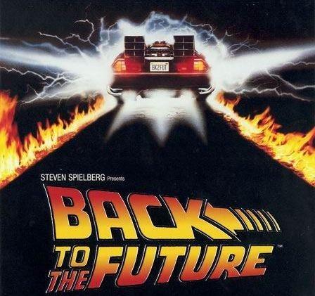
- Back to the Future
- Helveticanisms for everything serious and grown up... ;-)

’Typefaces’ of the 90’s (in no particular order)
- Comic Sans/Arial
- Impact
- Pixel typefaces
- Techno typefaces
- Everything stretched and bent, blurred and embossed beyond recognition

cheerio Queneau

Hmm thats a good idea. Any thoughts on what would be good for the 50s/60s era?

Hi Adam...

I’ve found that it is much easier to point out when a typeface is used anachronistically in a film than it is to say what would be appropriate.

That said, I would suggest doing some research at a library or somewhere you can look at magazines, advertising or books from the period in question. Another good resource for this kind of thing is the Taschen “All-American Ads” book series (assuming you’re looking for North American examples). Once you’ve got some examples of period typography that you like or would like to emulate, it’s just a matter of identifying the typefaces. If you need help identifying typefaces, resources like Typophile’s Type ID Board can come be handy.

For set decoration and costumes, you might use an old Eatons or Simpsons catalog.
So for type, look to ads in Macleans or Chatelaine from the appropriate era, or Art Directors Club annuals.
But if your film is more niche, check out niche publications.

Also have a strategy for temporal span: not every car on the street in any given year is a late model, but you have to decide how aggressive the mise-en-scène is in locating the action at a particular point in time.

With the 90s, you may have to specify which half you’re looking at. The early-mid 90s was all about grunge fonts and early Emigre stuff (Matrix, Bodega, etc.), and in the late 90s, once the web became prominent, things seemed to shift more towards cleaner and/or more “techno” fonts.

okay great, thanks for the advice guys. Perhaps a trip down the library won’t kill me. That or I could just re-watch Mad Men haha.

Currently I’m thinking I may use Neutraface. I know technically it wasn’t around in the 50s but its got a nice feel to it, and is absolutely beautiful.

You have to define usage, since definitive for text is different than definitive for adwork/display.

But here is my completely inaccurate, probably wrong analysis of the last 50 years. I don’t want to bother looking up the dates of the ITC fonts, so that is that.

1960-1980
Helvetica

1980-2000
ITC Garamond has got to fit into there somewhere. I dislike that face.
ITC Avant Garde has got to fit into there somewhere. I dislike that face also.
ITC Lubalin Graph has got to fit into there somewhere. Ditto. I notice a trend here.

2000-
Myriad

Neutraface has more of a 30s-40s Art Deco vibe to my eye. 50s typography tended to be either pretty plain with all the creative energy channeled into hand-lettered display scripts. Some possibilities:

Generously spaced Futura or Trade Gothic caps
Wide sans serifs like Venus Extended

For hand lettering, House’s Ed Gothic, Ed Script or Ed Roman would be pitch-perfect. Other possibilities would be Dom Casual, Balloon, Flash, or Murray Hill.

Surely place matters as much as time: in the UK, most of the middle of the 20th century could be set in Gill Sans ;-D
_______________________________________________
Ever since I chose to block pop-ups, my toaster’s stopped working.

Well its a pseudo-documentary about my Highschool which was built in 1956. Again, I was thinking Neutraface because it is just so freakin’ pretty, be it slightly inaccurate, but also Twentieth Century catches my eye.

I’m also trying to think of a serif that might work... I’d be really nice if it matched the typeface used in their first yearbook but that might be pushing it...

All the classics that came out of or were revived in the early 20th century were common in the ’50s: Century Schoolbook, Century Expanded, Caslon, Baskerville, Bodoni, Clarendon, Garamond... “CHIPS” appears to be some version of Century or Clarendon; the type on the title page appears to be Caslon Old Face or similar.

A lot of the stuff on Mad Men is slightly off — and evidently done on a Mac (or PC). Which is anachronistic in a compeletely different sense, of course.

. . .
Bert Vanderveen BNO

Woah, holy crap! Mark Simonson responded to MY POST!? THE Mark Simonson!? I feel so honoured. That article (and the one you did for a bunch of films) is what got me thinking about all this and ensuring I at least TRIED to use all historically accurate type.

So... thanks for that! haha

Well, I guess my P.R. is working. :-)

You’re welcome.

LOL

Captured from web.archive.org on 6 May 2009. view this capture