
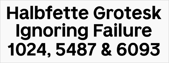
Hello, this is the second typeface I've designed so far (I'm a graphic design student). I set out to create a contemporary grotesk. Initially I added much more characteristics, like angled strokes (as in the lowercase e), etc. I've kept the extreme x-height. But now I've stripped it down, added more contrast and so on. It is not based on any specific typeface, except on personal preferences.
I would like some overall feedback, and especially on:
- Is it original? If you don't think so, please point me to similar types...
- Legibility
- Contrast & harmony
- Numerals & punctuation
- Style
- I find a, e, s, g the most difficult, what do you think about those?
Thanks!
/Marius
| Attachment | Size |
|---|---|
| Kyniker-Bold.pdf | 16.04 KB |


