Typophile

Not often I use my own fonts...

typerror

...in my commercial work.

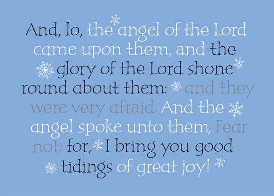
In the “card industry” facet of my work they want calligraphy. In this instance I used P22 Peanut and they will never know the difference.

What I think is cool in this piece is that this scripture can be broken into three threads, in different colors, and it still maintains its flow, and the three threads are cohesive. And who says that scripture is not divinely inspired.
Michael

Not too often can you say, “I used my own font for this.”

It is a great feeling :)

Lovely, Michael.

Looks especially good with the dropout white… kinda dances that way!

Enough alts and base bouncing that it gives Peanut its inherent the “joyous, fun” quality.

Michael

Pure genius. Not you Michael, the scripture ;)

: )

Michael

It’s gorgeous. I believe this is the first time I’ve seen both single- and double-storey as used in a single word without even realizing that something unusual was going on. I only noticed after looking closely and specifically for alts, so natural the mixing of alts is in this work. I wish all the snowflakes were unique, though.

Is this work now, for next Christmas?

Very nice indeed.

2010 Nick. As soon as Christmas finishes I start in January for the next year. Gives a whole new meaning to Christmas in July as that is when I will finish. For some other clients I am working for this year.

Already have my shopping done though! Talk about burn out : )

Michael

It is lovely.

I’m not sure you are open to critiques or maybe it is too late but maybe instead of gray you use a bluegray?

Simply gorgeous, Michael.

Thus spake Linus.

I will certainly mention it Miss Tiffany... Cost is most often “the” concern so I try to keep the colors to a minimum, hence the screen as opposed to a third color. They have not approved it yet, it may end up purple and orange : )

Did I miss something James?

Michael

Nice. The font is a very good choice. But, I don’t think I understand. You make fonts, but don’t use them? I rarely make a font that I can’t use. In fact, many of the fonts that I create grow from a need.

~~~~~~~~~~~~~

...from the Fontry

Now that I understand. Thanks.

~~~~~~~~~~~~~

...from the Fontry

I don’t do that much design any more, my fonts come from my calligraphic design of logos, titling and personal experiments like this one below. This font was purely self indulgence. Lo and behold one of my daughters unknowingly ended up with a tattoo in this font (God bless the inkster who bought the font). My children are, for the most, clueless as to what I do.

And on occasion I use the fonts as a sub to lettering. But I would rather create new “stuff” in ink : ) Then convert it to type. Rather than the other way around.

Michael
see the fonts
www.typerror.com

Sorry James I edited my comments with my website as you just chimed in. There are some of my typefaces on the website that you can see.

Michael

Those are very cool. Just bought pooper black for a job from MyFonts. Excellant work.

~~~~~~~~~~~~~

...from the Fontry

I am honored. Thank you very much.

Michael

Oh, are these silk-screened?

Just checked out your work on your web site. Just gorgeous, Michael.

No Tiff, just PDF’s of Quark roughs for Christmas cards. These will be PMS uncoated on an uncoated stock.

Edit: Is that what you are asking?

Michael

No letters were hurt during the manipulation process William. Even though it doesn’t exist! Hehehe.

Michael

Did I miss something James?

I was making a Peanuts joke.

James

I was going nuts searching all of my extraneous literature for an angel named Linus (which I had never heard of) that may have been part of the revelation in the scripture.

Boy am I thick! Did not see the obvious. Go ahead and laugh : )

Michael

Good on ya, mate! Top stuff.

I thought I was laughing with you Michael. Nice work.

I recognized Peanut the other day in a children’s book I was reading to my two year old. I told him, “Daddy knows who designed these letters.”

He spoke quietly in awe, “You know who made the letter ’G’? Wow. Can he make me a new letter?”

I told Nate you were a busy man. But you have two fans of your work in my house now.

Thanks Christian and Nate

I haven’t seen Peanut in print yet... but children’s books was pretty much the intent.

Pooper black on the other hand is all over the place in the grocery store.

Michael

I wonder if Biblical texts brings out the best in scribes, or if scribes bring out the best in Biblical texts. Probably yes, but either way, very nice lettering here and on your site!

Michael, the lettering samples on your site are great. for some reason i like the darker ones best. can you tell me what tools you did use for “anthrax”?

my daughter used to watch that Peanuts Christmas special over and over again. now that i think about it, maybe that’s why we called her little brother Linus :-)

Thanks

It was done with a “Ruling Writer”

Basically it is a large bladed ruling pen. It was done on cold press watercolor paper, hence the splatter and rough edges on the letters. When raking the pen across the paper the blades become much like a tuning fork... they vibrate causing the ink to “fly.”

Michael

I’ll see if I can find what book it was. It was a library book and I’m not sure if it’s been returned.

Haha, now that I recall I’m sure I’ve seen “Pooper Black” in the higher-end grocery stores (I can’t remember if it was Wegmans or Whole Foods, but something of the like). I love these typefaces.

interesting, Michael, thank you.
got try that myself when i get bored by pointed nibs someday :-)

very nice work!!!

Well played Sir.

This makes me think about “how often do musicians listen to their own music?” For enjoyment, not business.

Are any of you typophiles in a band?

“The typophiles”

I’d definitely pay a few dollars to see that show (regardless of the poster design or musical genre).

I used to be in a Metal band back when I was a teenager. Now I just Letter.

:)

Captured from web.archive.org on 5 May 2009. view this capture