
Trebuchet is a very nice face. It's a well-designed neutral sans with a touch of U.S. Highway for extra clarity. Its personality gives blogs that professional but still personal human voice. Can we hear it for Trebuchet? Humor me.
Trebuchet is a very nice face. It's a well-designed neutral sans with a touch of U.S. Highway for extra clarity. Its personality gives blogs that professional but still personal human voice. Can we hear it for Trebuchet? Humor me.

It's overlooked and maybe (for an available default font) underused, but I kinda think that's its niche.

I used to dig it, but now I find it a little on the ugly cousin side. The super short as/descenders make me wilt like an unloved macaroni flower. I used to find the g nice and original, but it calls attention to itself now. I sincerely hope I have not changed your outlook; these are strictly my own thoughts. ; )
@Eliason Definitely niche. Well put.

In the fast sea of available typefaces, yea, it's definitely an ugly cousin.
But in the limited invite list for web fonts? It holds its own quite well and is definitely a handy option.

As aluminum says, I think Trebuchet is good for web, because of the limited list available for that (at this moment, maybe not anymore in the very near future). I like the fact that it has a real italic, not just an oblique.
And don’t forget: Trebuchet is a Vincent Connare design! There is life after Comic Sans…
> Trebuchet is a Vincent Connare design!
What credence does this lend?

I like it.
-=®=-

Trebuchet is a very nice face.
Fail.
It’s overlooked
Fail.
I like it.
Fail.

>Personal Bio
>A very Good Designer.
Well that doesn't make up for being an ******* does it? ;-)
Good home page, though :|

I hate it. Is it actually supposed to be so lumpy and badly drawn or not? It's hard to tell.
Nick Cooke
Oh well. My sentiment was sincere, but mostly my hope was to see Vince take some genuine pride in a job well done, maybe finding that it feels better than lapping up ironic public attention for a train wreck. I'm sure he'll take an interest now that the thread is mostly negative.
i'm sure he has better things to do. really.
>Good home page, though :|
Yes, lovely iuse of Arial :-)
I mean it: for me, Trebuchet is a good design. Human touch but still serious and convenient for screen.
Another thing I like about Trebuchet: lowercase l different from Uppercase I (not very common in sans designs).
I only mentioned Comic Sans because many of us hate it so much, but Trebuchet is a very different stuff. Not every popular font is a bad font, right?

You guys are missing one valuable point about Trebuchet: It's the narrowest useable sans-serif for the web. Narrower than Tahoma, but not as nice. If space conservation is your thing, and you must use a sans…

Typophile forums are now a confessional? Sometimes I like to eat the occasional hot dog.
Thanks Dan for bringing it back to utility.

Sometimes they are confessional without it being intended as such... ;-) I am included in that of course.
amen

I think Trebuchet works really well on TV. It's the typeface I use when I need to set subtitles.
It's certainly interesting to look at the bi-level hinted fonts and how well they hold up under modern rendering technologies.
Good home page, though :|
Yes, lovely iuse of Arial :-)
Maybe I should have used Trebuchet? Just kidding, that would be really Amateur.
I think Trebuchet works really well on TV. It’s the typeface I use when I need to set subtitles.
AHAHAHAHAHAHA. There you go.
Trebuchet, the thinking mans comic sans.
Thanks for removing all doubt.

I was surprised to find that a rather handsome all-caps headline was set in Trebuchet the other day. Not sure I'd use the lowercase for anything other than a blog or website but the caps work quite nicely for a titling font.
AHAHAHAHAHAHA. There you go.
I don't get it, Höfe.

Trebuchet has a lot of good points: an interesting lowercase l, a beautiful g, a good bunch of true italics, it saves space (maybe trees too) without being too compressed, etc.
It's not the best, but for web design is a good choice.
>Trebuchet, the thinking mans comic sans.
Ok, I am curious about what do you use.
>Ok, I am curious about what do you use.
Like all "very Good Designers", lovely types like this one...
http://typophile.com/node/53499
...unless of course the ID was for a "friend" :-P

It was one of my favourite 'stock fonts' in my pre-typophile days.
I think it was the first time I'd seen the 'et' ampersand and I recall that really intrigued me.
Like all “very Good Designers”, lovely types like this one...
You like Trebuchet and your mocking me? hahaha fail.
Anyway, I just worked out the thread, cerulean is clearly taking the p*ss. He actually had me going. Good one.
>You like Trebuchet and your mocking me? hahaha fail.
I can see you dislike Trebuchet, but you are not answering, Höfe… Please, I really want to know. What fonts do you like and use for screen jobs?

I like Trebuchet, for all the reasons stated above and more.
Sure, the umlauts are a bit wide, but I rarely set German text so that isn't a great concern to me.
Anyway, I just worked out the thread, cerulean is clearly taking the p*ss.
I doubt it. And I, personally, would prefer not knowing what gets you going, in case it's something quite distasteful.

i remember the first time i took trebuchet seriously was when i had to update some really small ingredient labels for boutique chocolate at my old work, i thouhgt 'gee that tiny 5-point type looks good, then i discovered it was trebuchet, which means it's one i think of as good for really small printed stuff if you need a system font for the job.
anywho...

I don't hate Trebuchet, like I don't hate cigarettes.
But I've never used either one seriously.
--Me (misquoting Nick Shinn)

As a web designer, I look at Trebuchet as the Windows fall-back font for Lucida Grande.
It's a more suitable replacement for headlines than Verdana or Arial. And that's the way it goes on the web.
Ditto: Overlooked. Underused. Niche.

I really dislike Trebuchet, I rather prefer Tahoma or Verdana, I don't care about true italics as much as good letterforms.
>As a web designer, I look at Trebuchet as the Windows fall-back font for Lucida Grande.
As our 12 year old friend would say - "fail!" :-)
I think Windows has included Lucida Sans Unicode for longer than Apple shipped Lucida Grande? Yet another case of Microsoft copying Apple in advance.
>>the Windows fall-back font for Lucida Grande
Sii beat me to the punch, but Lucida Sans/Grande is practically the only typeface that has a native system variant on every Operating system. For Linux, Luxi, although not Lucida, is certainly a very closely related cousin and Lucida Sans also ships standard with Java.
Because of this thread, I'm actually going to design a webpage that exclusively uses Trebuchet. How about them Apples, eh?

"Yet another case of Microsoft copying Apple in advance."
A common misconception among busily entrenching kleptocrats. :-p
"...Lucida Sans/Grande is practically the only typeface that has a native system variant on every Operating system..."
Not surprising, any operating system with native blurry-bot rendering needs a simplified san serif (or ten), so their blurry-bot rendering will not show up, (at the top of your windows at least).
Cheers!
Do you remember the fonts we had to hint for the first tests for Apple to bid for the next font format on Macintoshes?
Lucida Bright!
I'd type this in Chalkboard if I could.
How come Lucida Grande looks fantastic on the mac, and Lucida Sans looks average on the PC? is it just a screen-rendering thing or are the designs really that different?
I think David explained that (in his own special way)

I've never liked the g of Trebuchet. Ever. But I'm quite particular about the g.

I still quite object to the fact that the endash and hyphen look exactly the same, a clear error.
—
Joe Clark
http://joeclark.org/
I MADE THE FIRST EVER BITMAPS OF TAHOMA FOR THE WINDOWS 95 SYSTEM ENGINEERS since Mr Carter delivered Mac Font-tastic Plus negative sidebearing bitmaps. I had to remake them and change some things and compile them into 2.fnt files so they could be usable...so there.... start whinging about Tahoma now
Damn you Vince for that Tahoma! I see it everywhere! Totally inappropriately, like on websites that need "Verdana" but are too cheap to purchase the extra pixel widths. How brash and irresponsible!
:)
@sii - to be honest, i was confused by his post...
@sii - to be honest, i was confused by his post...
Confused? Well, there is an inverse relationship between the font(s) we think of as highly readable in high resolution text, and the font(s) we are force-fed because they are easy to render at low resolutions.
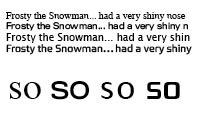
What to do? Sheep love Trebuchet, Verdana and Lucida anything — wolves roam.
Cheers!
Omg I hate this font with a passion!! That lowercase 'a' always pisses me off and the splayed edges. The 'g' too. Just so awful and annoying and like Arial I gotta see it everywhere *shoot me*
@ holf :
"fail"
holy shyte. brilliant. such insight is waisted here.
@ nycionx: breathe slowly into a paper bag. you'll feel better.
I love resurrecting old threads just to talk trash! Now that webfonts exist, may those who hate never worry about Trebuchet again. It's not the best, but it's not the worst, and may it rest peacefully amongst the OG Core Fonts.
Big Brother in Holland's first logo was in Trebuchet then they took out the words and turned to shite.
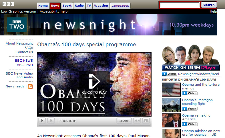
Newsnight had it as a logo for years now it is something so boring no one knows what it is.
Apple's iCards were in Comic Sans then they went and made Chalkboard after they copied the trash can and multitasking from Xerox and Microsoft and re-invented System 7 as iOS 7 but no Newton support or TrueType GX.

Actually Apple swiped the whole GUI idea from Xerox PARC; but Macs did not have true pre-emptive multitasking until System8. For a long while the only personal computer with true multitasking was the Amiga.
hhp

Actually Apple swiped the whole GUI idea from Xerox PARC
That may be true, but it shows that having a nice idea does not count as much in the end as turning it into a product that is accepted and appreciated by a large audience. And that is only the start. Looking back, we may say that Apple almost did not survive the starting period because Lisa was a flop and that Amiga did not survive in the longer run.
For a long while the only personal computer with true multitasking was the Amiga.
Hmm … Amiga … my former colleague Jelle Bosma used to have one. He was even able to program an editor with which he could read in, on-screen edit and export IK-Format on that machine. That way he did a part of the corrections on Forlane, the predecessor of Cambria, while working at Scangraphic. Where did Amiga got lost again? Not being able to switch to the PowerPC or Intel platform in time? Windows 3.1? Others outbeating them on the video-editor software market?

As I recall, the Black Ghost – the Sinclair QL – also had pre-emptive multitasking in its OS.
Re the Amiga, I think Commodore got too used to it being a nice little earner for them, plus the Attack of the Faceless PC Clones.
having a nice idea does not count as much in the end
But for some of us being honest does.
Amiga died because of zero marketing - its eventual owners made more money killing it; because culture and money aren't the same thing. On every technical front it was superior to anything out there, years in advance. I ran Fontographer via Mac emulation, and it ran faster than on a Mac; I also had a Windows emulator (which however required a card). My 3000 is still in the garage. :-) The 500 I had donated to a small Armenian TV show.
hhp
having a nice idea does not count as much in the end
But for some of us being honest does.
OK, let’s agree that it counts in a different way :–)
All resurrected threads must include a reference to the Amiga and Fidel Castro's Rolex, so just setting the record straight.
Did I ever tell you about the time I put an Amiga in a freezer... http://jdanddiet.blogspot.com/2013/05/retro-gamer-article-extras-interce...
Upping the ante: AmigaOne X1000. I think I actually want one.

Great interview Si, I have friends who live in Burghfield Common and play for Tadley RFC and I will never think about the area in quite the same way again!
>Burghfield Common and play for Tadley RFC
Burghfiled was where the nukes were stored, and Aldermaston's proximity to Greenham Common air base made the neighborhood pretty much target #1 for the Soviets. It was good to know that when the bomb dropped it would be instant vaporization.
Exactly what I was told when I first visited, it filled me with a warm glow!
Captured from web.archive.org on 25 Apr 2015. view this capture