Typophile

Bullet Operator, Hyphenation Point, Period Centred

Bendy

I’m trying to figure out my dots and bullets :S

I’ve found the Character Design Standards and the Decode Unicode fairly helpful but am still a bit confused and not sure if I’ve done things right.

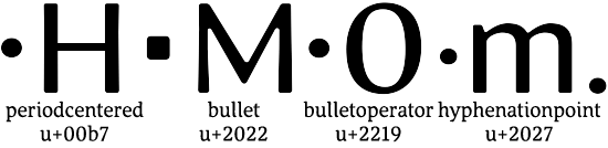
I have periodcentered (U+00B7) and hyphenationpoint (U+2027) the same. It’s a full stop (period) centred on the x-height, whilst bulletoperator (U+2219) is the same but centred on the figure height. Is this conventional?

The advance width is the same as full stop (period), but perhaps they should be set on an en-space?

My bullet is a larger rounded rectangle centred on the cap height...should this be just a circle or is it ok to have it stylistically harmonising with the overall shape of the font? Actually my numerals are the same height as caps in this font.

And which of these should I gpos using the case feature for cap alignment? All of them?

Thanks very much in advance :)

I don’t know all the formal uses of the period centered — sometimes, in English, it is used as a bullet. There s another “centered period” in the mathematicl codepoint region that signifies multiplication in math, and conjunction in some notational systems of formal logic. That one should likely be a bit bigger than a full stop. If there is only one “technical” centered period codepoint (I don’t remember), positon is an issue. Usually numbers (for math) are lining. But in logic, expressions typically use lower-case alphas. Guess I’d go with the numbers.

I don’t know of a formal use of U+00B7. It does show up sometimes in linguistic constructions. It is also frequently used when the bullet character in the font is too big, & it is easier for the comp to slighly enlarge periodcenterd than to reduce the bullet.

Which gets us to the limits of responsibility of the font designer. You will not be able to please everybody. Text is different than display. When I was learning the trade, a 2-point bullet at text size (call that 10-point type) was considered about right. That means, if you measure the “black” of the bullet, it is 2 points, 0r 200/1000 em. That may have changed in our new, brave world where branding is everything. Most bullets in the font were far larger. If you set them at a smaller size, you had to also raise them up. Same with a period centered that was to small — except setting them in a larger size meant you had to move them down.

You should have at least one bullet character that is a round bullet. If not, sure as shooting some editor, graphic designer, author (client) will object. If your want your design of the bullet to be standard, allow switching to the round bullet via a stylistic set.

Usually, a bullet is used with the following word beginning with a cap, but not always.

Sidebearings are also up in the air. The usual list structure is “flush & hang,” & I, anyway, use tabs. Too large a sidebearing get in the way of the “flush.” The space on the right is controlled by the tab. But there are cases where a sort of paragraph style is used with a bullet, so some space is needed. I’d say about 100 units. If the comp wants more, they can insert a thin space.

In short, give the comp something to work with, and down’t worry overmuch.

FWIW

Thanks for your help :)
Here’s what I ended up with:


I made periodcentered and bulletoperator larger than the full stop, both centred on the cap/figure height.
Hyphenationpoint is a period centred on the x-height.
Bullet is not round.

Ben, did you make the bulletoperator more “flattened” / less round than the periodcentered, or does it only look like that in the gif?
These various point shaped things have me confused. Thanks for this thread!

Odd yes, let me check...looks like somehow the bulletoperator had slipped down 3 units and the rasterisation is totally different. Thanks for spotting :) I’ve fixed it now. The sidebearings are less than periodcentered (70 units vs 85). The actual blob is identical. There’s also U+2023 which is a triangular bullet a similar optical size to the square one above. Hope I’m also right in using periodcentered (nudged up slightly) for Ldot and ldot.

I think I’ve also figured out dashes, hyphens and minus finally, and straight quotes vs curly quotes vs prime/double/triple primes. Seems there’s no fully comprehensive ’type encyclopedia’ for glyph design. Wait, no, there’s Typophile! :D

Hey, now I’m confused. Is your periodcentered U+00B7? The Character Design Standards list U+00B7 as the middot (which for some reason in decode unicode appears as a square), and mention the periodcentered and bulletoperator under one unicode (U+2219). Argh. :-\

BTW, whenever this stuff gets too complicated, I go and work on my hedera.
Great relaxation exercise ;-)

I find the information structure on that Microsoft index really confisung. AFAIK periodcentered and middot are two names for the same codepoint...U+00B7 seems to be named differently inside different fonts...in fact bulletoperator doesn’t appear in many fonts unless I’m mistaken.
My thinking was that U+00b7 should be for bulleted lists (so has larger sidebearings), whilst U+2219 was for mathematical ’multiply’ as Charles mentioned above. Middot seems to be ambiguous.
I wonder if anyone else can shed some light here? Otherwise I’ll have to investigate all the fonts on my system to see how they deal with it all. Gross :(
Trying to cover 4 people who are out of the office today, what a mess! :S

“really confisung”
;-) Argeed!
I thought the “bullet” (U+2022) was to be used for bulleted lists.

Although maybe we should really take Charles’s advice, and learn to stop worrying (and love the bullet).

  • I generally align the bullet with the em and en dash, slightly above the vertical centre of lower case “o”, as in Georgia.
  • The reason being that bullets are generally used with lists that are set upper and lower case.
  • In that situation, the reader sees lines of text with the dominant vertical position being the centre of the x-height.
  • As the bullets “initialize” these lines of text, it makes sense to have them aligned accordingly.

>confisung
oops!

Makes sense for bullet to be used for lists; but then is periodcentered just an alternate for that?

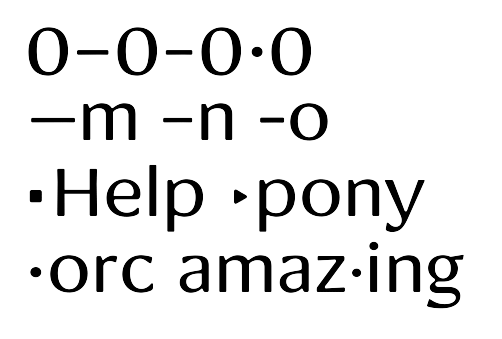
I moved everything down to align with the dashes, except the minus, figuredash, and bulletoperator (first line)

The second line shows emdash, endash and hyphen (thicker and perhaps too short?)

The third line shows bullet and trianglebullet (U+2023).

The last line shows periodcentered and hyphenationpoint (U+2027).

Nice bullets! I love the choice of square, triangular and round. I had no idea there was a codepoint for a triangular bullet – neat.

OT: I think your hyphen might be just fine, but I’m wondering if the dashes couldn’t be a bit longer? Seeing it like this, the endash looks maybe a bit too similar to the hyphen. But I know you weren’t asking that. :)

Victor Gaultney gets it right in Gentium:

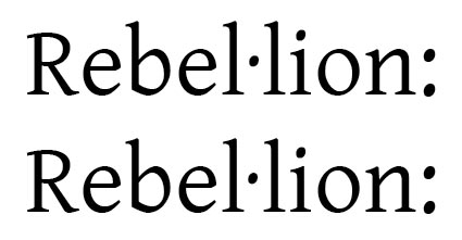
This concerns the “ldot” character used in Catalan to indicate that both “l”s of a double “l” sequence are pronounced separately.
Above is the word rendered using two “l”s and periodcentred, below as “ldot” followed by “l”.

The rendering should be identical, and the dot should be tittle-sized and just about halfway up the “l”.

Thanks Nick :)
If the periodcentered is about halfway up the l (same height as minus for example) then it won’t be the same level as the bullet or dashes (which I’ve moved down to slightly above the middle of the x-height as Nick suggested).

And it seems I should shrink it to match the tittles. Then recompose ldot and Ldot (presuming Ldot should have an identical dot).

So then I’m left with no circular bullet comparable to the square one. I’ll have to do an ss01 or salt?

Captured from web.archive.org on 6 May 2009. view this capture