Typophile

Menu Critique / Body Typeface advice needed

jw2626

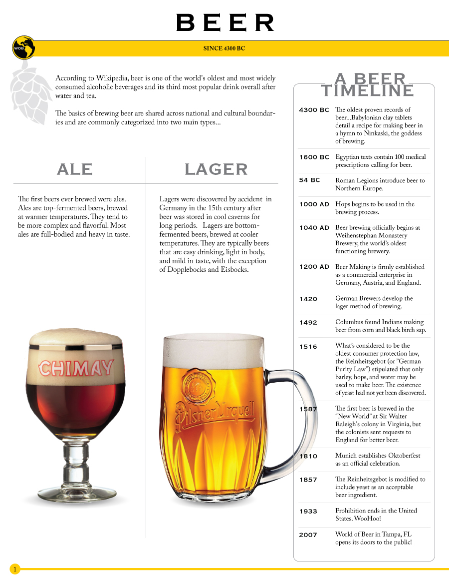
I'm pretty amateur when it comes to typography and design, so looking for some honest feedback here. I'm designing a menu for a client, World of Beer. They have over 500 bottled beers, so the menu is pretty extensive. The table of contents will be as follows...

Beer Basics - p.1
Beer Styles - p.2-3
Bottle List - p.4-13
Mixed Drafts - p.14
Wine List - p.15
Cigars - p.16
Food - p.17

Their logo uses a variation of Copperplate Gothic, so I was looking to use that typeface for the headers, but I have no idea what to use for the body. I started with Arial, but definitely do not want to use that. I looked at Adobe Caslon Pro, and thought that looked better. Any other suggestions? Should i use a sans font b/c the headers are Copperplate, or does that not matter? One thing to keep in mind is that the reader will be in a somewhat dimly lit bar, so readability is very important.

All comments welcome. I have thick skin :] Thanks in advance, J.W.
Hi :)
It would be really great to see a pdf version.

The things I noticed as I scanned through:
Generally the type seems quite small and the look is very clean.
In the intro section, I'd remove the words 'According to Wikipedia'. I'd turn off hyphenation. That ellipsis needs to go.
In the Lager section, you have two spaces between the forst and second sentences. The word 'in' in the first line also looks disconnected. I'd justify the text as it's in narrow columns.
The 'Beer Timeline' needs more leading between the two lines of the title. It's not centred on the box.
Typo 'Hops begins...'
Capitalisation of 'Beer Making', 'Legions' and 'Brewers' pokes me in the eye.
'Indians' is not the correct word for native Americans where I come from.
Is WooHoo two words and does it need a capital H?

On the second page, the Name column needs the heading aligned with the text, as in the other columns. Wow, what a lot of beers! Would it be a good idea to sort them by brewery rather than alphabetically by name? I'd prefer the word 'style' to be 'type'...maybe that's just me though.

Like the page numbering but perhaps bold would be a better contrast for the size of text.

Hope that's helpful :)

Wow. Great info. Thank you! The menu is still in its very rough stages, but i appreciate all of the detailed info. I'm working on those changes now. I'll compile the whole thing into one PDF and upload it for everyone to see and critique, BUT I would really like to hammer out what fonts i'm going to use first, so that i can avoid having to make all those small alignment changes that come up when using different size fonts. Anyone have any ideas? Adobe Caslon Pro is the winner as of right now.

One stipulation that I am faced with when choosing the font for the body is that the bottle list portion of this menu will actually be generated through an ASP.NET application using Crytal Reports. It will be a centrally hosted application that is accessed by each different World of Beer location, who will then generate and print the menu at that location. I'm not yet sure how that will affect the flexibility what fonts i can use, or if it's as simple as having each location install whatever fonts we decide to go with. My thought is to lean towards a somewhat "standard" font, but i'm open to all suggestions.

Thanks again for taking the time to write all of those comments. I replied to each below...

-------------------------------------------------------------------
Generally the type seems quite small and the look is very clean.
-- Do you like the Adobe Caslon Pro? Would it look better with a sans typeface?
-------------------------------------------------------------------

-------------------------------------------------------------------
In the intro section, I’d remove the words ’According to Wikipedia’.
-- Agreed. Client provided that copy, but I think i'll have to veto that decision.
-------------------------------------------------------------------

-------------------------------------------------------------------
I’d turn off hyphenation.
- Ok, wasn't sure about this. I personally don't like hyphenations. What if i full-justify the paragraphs under "ALE" and "LAGER"? Should i still turn off hyphenation?
-------------------------------------------------------------------

-------------------------------------------------------------------
That ellipsis needs to go.
-- Replace with a colon? Or just put a period? Trying to lead into the ALE/LAGER section.
-------------------------------------------------------------------

-------------------------------------------------------------------
In the Lager section, you have two spaces between the forst and second sentences.
-- Oops. Will fix.
-------------------------------------------------------------------

-------------------------------------------------------------------
The word ’in’ in the first line also looks disconnected. I’d justify the text as it’s in narrow columns.
-- True. Will justify the text.
-------------------------------------------------------------------

-------------------------------------------------------------------
The ’Beer Timeline’ needs more leading between the two lines of the title. It’s not centred on the box.
-- Agreed and agreed.
-------------------------------------------------------------------

-------------------------------------------------------------------
Typo ’Hops begins...’
-- oops.
-------------------------------------------------------------------

-------------------------------------------------------------------
Capitalisation of ’Beer Making’, ’Legions’ and ’Brewers’ pokes me in the eye.
-- will fix.
-------------------------------------------------------------------

-------------------------------------------------------------------
’Indians’ is not the correct word for native Americans where I come from.
-- very true!
-------------------------------------------------------------------

-------------------------------------------------------------------
Is WooHoo two words and does it need a capital H?
-- yeah, two words and no caps would be better.
-------------------------------------------------------------------

-------------------------------------------------------------------
On the second page, the Name column needs the heading aligned with the text, as in the other columns.
-- Yes. Was planning on aligning "NAME" with the letters of the alphabet below, and having those letters stick out a bit like they are so the reader can find them more easily. Would it be best to align all of it (header, items, and letters) the same?
-------------------------------------------------------------------

-------------------------------------------------------------------
Wow, what a lot of beers! Would it be a good idea to sort them by brewery rather than alphabetically by name?
-- We went back and forth with this, but b/c of all of the consolidation of breweries, it's tough. I can't tell you how many product lines inBev now brews, and Groupo Modelo makes Corona, Modelo, Pacifico, Tropical, etc. We believe that it will be easier if we include the product line (e.g. Sam Adams) in front of the name, and order them that way. Sam Adams is made by Boston Brewing Company.
-------------------------------------------------------------------

-------------------------------------------------------------------
I’d prefer the word ’style’ to be ’type’...maybe that’s just me though.
-- Client prefers "style".
-------------------------------------------------------------------

-------------------------------------------------------------------
Like the page numbering but perhaps bold would be a better contrast for the size of text.
-- Agreed.
-------------------------------------------------------------------

Ok, I'm going to go out on a limb and suggest Plantin. I think a serif font is good. I find Caslon a bit light on the page and a bit too elegant somehow...I'm certainly not an expert though, so perhaps others can weigh in too.

>What if i full-justify the paragraphs under “ALE” and “LAGER”? Should i still turn off hyphenation?

I'd see how it looks with justified non-hyphenated text. You can always play with tracking and word space manually if it looks uneven.

>Would it be best to align all of it (header, items, and letters) the same?
Not sure, maybe. I quite like the outdented alphabet letters.

That ellipsis at the start should grammatically be a colon; but because of the layout I think a full-stop would be better.

The second sentence is ungrammatical. It reads "The basics of brewing beer ... are commonly categorized into two main categories". You have a missing subject (beer) which needs to go in there. (It's not the basics that are categorised, it's the beer, isn't it?)

Actually, I'd reword the sentence completely because 'categorized...categories' is strange anyway. Perhaps: There are two main types of beer, and their methods of brewing are shared across cultures and national boundaries. Or: The two most common processes for brewing beer are shared across national and cultural boundaries, and result in two main types of beer.

It's still not very interesting as a sentence. That's the problem with lifting text from Wikipedia; it's not written as menu copy ;)

How about listing the 'styles' of beer under the two headings so we can see whether 'Imperial IPA' or 'Dunkelweizen' is an ale or a lager?

I might put more space between the hops and the text too.

Captured from web.archive.org on 25 Jul 2014. view this capture