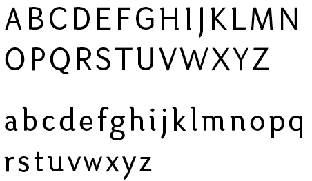
Hi everyone. First post here, although I've been frequenting the boards for a while.
So a brief summary of the concept... After moving to Wellington, NZ a few months ago, I began working on this as an observation/exploration of the type and design in the area. I was originally particularly struck by the Wellington logo(see below) but wanted to try to come up with something that would be a little more practical, while reflecting some of the more conservative signage around the city.

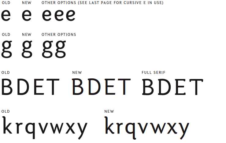
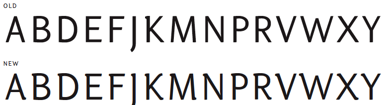
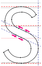
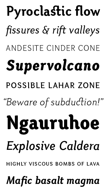
Originally I intended for this to be a display face, but I'm thinking I'd like to get it to work at smaller sizes such as 8 or 10pt. I haven't worked too much on the spacing yet, and still have a few glyphs to fill out. The PDF below has all the glyphs I've completed and some text samples.
I'm fairly new to typeface design, so I'm sure there's lots of room for improvement on this. Any thoughts and advice would be greatly appreciated.
| Attachment | Size |
|---|---|
| otariComp.pdf | 52.61 KB |
| otariComp19.pdf | 472.53 KB |
| otariComp026.pdf | 271.16 KB |
| OtariJan23.pdf | 848.5 KB |