
Hello,
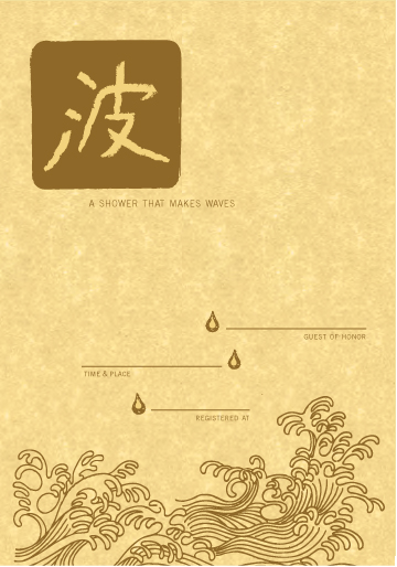
I think this is coming along, but I am not sure about the typeface and the use of white space. Any other comments most welcome. I want it to work as either a baby shower or a bridal shower invite.
thanks!
Hello,
I think this is coming along, but I am not sure about the typeface and the use of white space. Any other comments most welcome. I want it to work as either a baby shower or a bridal shower invite.
thanks!

is this a bukkake event? Really pretty invite. what about printing it on Japanese paper?
Thanks!
What is a "bukkake event"?
The paper is actually the texture you see underneath it is Parchtone by French paper (but if I were not using that then I would do your idea).
er… it's a bit rude, but I'll tell you if you want. maybe more drops?
I guess I don't need to know : )
More drops where though? At the top?
lots of drops everywhere, but less bold than the drops you've used as markers/bullets; I mean it is a shower after all. Maybe some of the drops could hit the waves making splashes?
P.S. type bukkake into google and I'm sure you'll get more than enough information :]

@Bloodtype: HAHAHAHA, terrible. My college friend's roommate used "bukkake" as their network name to trump other offensive names for networks in the area.
I think the typeface either needs to be larger, or have more contrast, because it is EXTREMELY hard to read. Also...the color I think is a little too yellow-toned, honestly...it's sort of a poo brown. I really like the overall design, I would probably also play with the spacing of the lines.
Also, perhaps instead of Caslon, if you wanted a serif typeface, High Tower Text is pretty nice (included if you have windows xp or up), it's a little more soft...this typeface almost seems too...edgy?
Hello angechilada,
I wondered if Trade Gothic was too edgy...I wanted something simple, but both Trade Gothic and Caslon don't quite work.
The color is not exactly right on screen: it will be a metallic bronze-gold on a yellow parchment color... knowing that do you still think it would be too yellow/ poo brown?
Play with the spacing of the lines vertically?
thanks!
Well, you could also use the fonts for the japanese characters, so it looks distinctly like the typefaces used by japanese-only computers etc. (not the actual kanji, but the typefaces have regular letters)
and yes, I meant vertically. The distance between the last two lines looks uneven, as well.
Also, I think even if it will be a bronze/brown color, I would print it on more of an ivory color so it wouldn't clash as much, that would probably also help with the contrast.
Hi angechilada,
I see what you mean about the contrast, my only concern is that while ivory and gold DO say wedding shower they don't say baby shower and I was hoping that by using a yellow color I could use this for both. Though I admit I did originally want a much lighter shade of yellow...but French paper doesn't make one.
i will check on the lines.

I really like this, but I think you could make the droplets less stiff. They stand out a bit too much from the fluid motion of the waves and the symbol at the top. And actually, I like the typeface.
Hi Kimothyschma,
Thanks...I think I am going to keep the typeface...Do you mean the drops are drawn too stiff or placed in a stiff way?
thanks!
the chinese character is wrong
it means "ball" not "wave"
http://www.ehow.com/video_4402905_write-wave-chinese-characters.html
http://rlv.zcache.com/surf_chinese_character_mousepad-p14464300082281072...
the second character is "wave"

The kanji is correct. Read as "nami" in Japanese 波。
The character 浪 can also mean "wave" but usually has the sense of "billows" or "wandering" Eg 浪人 "ronin" a wandering man = samurai with no master. Use in Chinese may be different.
Your character is more common one for "wave" in Japanese
You might like 浴 "to bathe, bask in sun, to shower"
You guys are great! Thanks. I did want it to be a Japanese character...the reason being that I wanted it to be an asian piece and not specific to one country so I used a chinese style illustration for the waves and then wrote wave in Japanese. Do you think that is a bad idea? Should I make the whole thing Chinese?
thanks!

波 is also wave in Chinese. I think 浪 is a more white-water, surfer type wave and 波 is more of a rippling undulating wave.
(波動拳 is also the surge-fist or "hadouken" from SF ... )
I think the thing that sticks out for me is that the style of the waves and the character don't match. The waves are very crisp, whereas the character looks brush-drawn. Would it be possible to roughen the edges so the waves also look like they're drawn with a brush? Also maybe the wave design should reach to the edge of the paper on both sides to make more of a solid block.
Or alternatively do the character and droplets with sharp edges. Maybe even round and cutesy as it's a baby shower. Were you thinking Hello Kitty or Hokusai?
Hello,
Thanks for the suggestions Edward ...I like the way you put it (hello kitty v.s. Hokusai). I changed the style of the drops and calligraphy to go with the waves since I liked those best...I also then changed the typeface to Gotham rounded to keep with the feel of it.
Okay all...I sent it to the printer..thanks for all of your helpful comments!!!
Sorry, not sure if you are still working on this. I meant the drops were drawn too stiff. They could look more fluid like the waves at the bottom.
Captured from web.archive.org on 25 Jul 2014. view this capture


