Typophile

Eklipse - a new ultra-black typeface

rafaelneder

Hello typophiles,
this is Eklipse, my new typeface designed to defy the limits of legibility. She is also a journey into a universe of strange possibilities. With multi-lingual support, contains more than 60 ligatures and contextual alternates! Eklipse fits perfect in headlines, logos and small blocks of text. It's available throught MyFonts.com with a limited time discount.

http://new.myfonts.com/fonts/neder/eklipse/
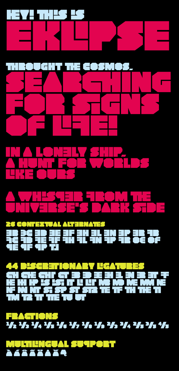
The letter design would work as a logo or poster title, but not as a display type

Bravo! Love the alts/ligs.

I like it.

This is the most interesting take on this genre I’ve seen so far. Good work!

Hello Robert. I´m suspect to say that but I disagree with you. Off course this is not a typeface for a mass journal, when a rapid comprehension of the headine is the key. This kind of typeface is for specific audience and when I was designing Eklipse I have this in mind.

Marcox, Quincunx, James thanks for the compliments. James, as you said is really difficult to create something new in this kind of style.

Best,
Rafael

Nice. I could see this getting a lot of use with the screenprinted concert poster crowd. The backwards characters are a great idea. Well done.

Captured from web.archive.org on 15 Apr 2015. view this capture