Hi all,
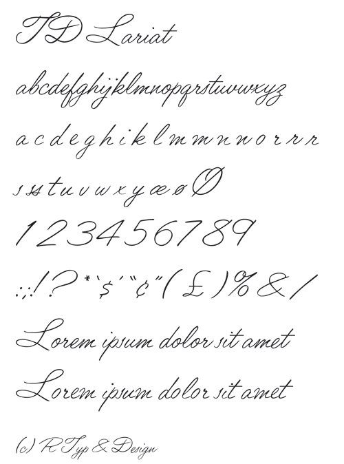
This is an old photosetting font which I am digitizing for my company. I would appreciate any suggestions for changes or improvements that can be done without losing the character of the original font. I know that the color needs to be made more even - any thoughts on that?
(I tried uploading a pdf, but for some reason that is taking forever. I might put it on a different server if anyone is interested.)
/Måns