Typophile

What is the best way to present your typeface to the world?

dmarx

If you have created a new font and want to share it with the world how would you make its debut? Obviously, you need to show the font in different sizes with different word combinations. But do you share conceptually how and why it was created? If it is for print do you create a booklet or a poster? Or, would you just create a website with examples of how the font can be used? I know you can go to any font foundry's website and see the different typefaces and how they are used but there is something about seeing that typeface in a well designed piece.

Emigre creates beautiful booklets that show the new typeface and how it can be used in a design.

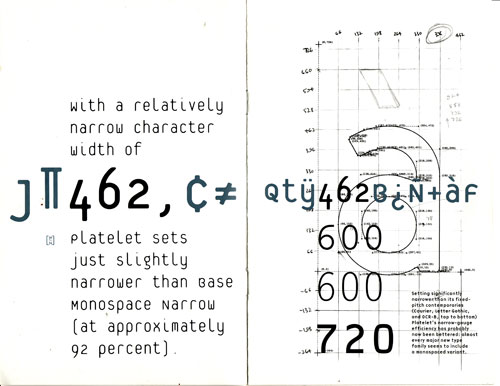
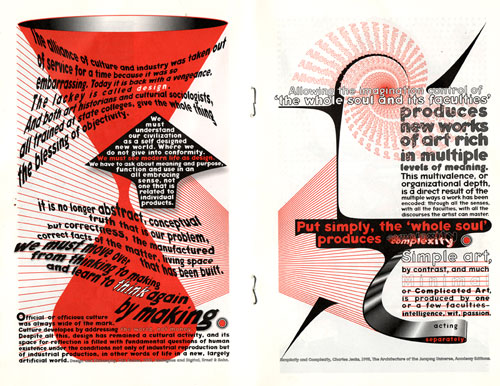
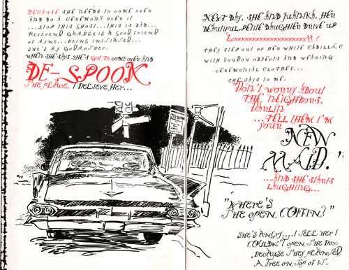
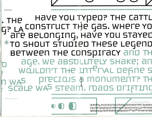
Here are examples of spreads from a few Emigre booklets:

Platelet
Keedy Sans
Not Caslon
Cholla
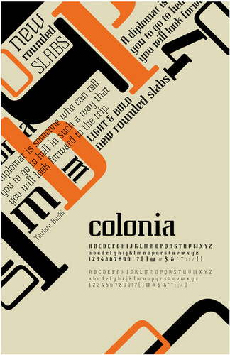
Here is an example of a online poster showing the typeface Colonia by Taulant Bushi
http://www.typographyserved.com/Gallery/Typeface_Design/168100
Build ten meter tall letters, paint them fluorecent green and place them in you driveway.

The font I created, Knot Linear, was inspired by the knots, twists, and turns in some three dimensional wire letters that I made. The concept I had behind this font was to capture the playfulness and interest of the wire letters, while still creating a cohesive, clean typeface. The font includes variety in thick and thin strokes, as well as rounded serifs. Overall, I think that it has grown into an effective display typeface.

I think that a poster displays a font well because there is endless possibilities of how to combine point sizes as well as direction and balance. For the poster I made to "advertise" Knot Linear, I developed a story that tells how the typeface originated, or in this case, landed on Earth. This design is the front of my poster (though it is not completely finished) and the story is as follows:

Somewhere, far away in our own galaxy, near Pluto we suspect, there was a war of the native Font Tribes of that cold moon. The Knot Linears were forced to become refugees, they were just not linear or symmetrical enough to compete, and they wondered the galaxy looking for a new home. Mars was hot enough to melt their metal bodies (or so they felt, Knot Linears are known for being melodramatic), calling Saturn home just didn’t have the right ring, and Jupiter was a bit too gassy. On Earth, however, they found many odd and nonsensical shaped beings. There was also a lot of metal, which they worshiped due to being made from it. After watching the native life, it seemed like a nice place to live, where they could fit in well, and where they could even make nests in the lush vegetation.

And so, on a clear dark night in New Orleans, Louisiana, the tribe of Knot Linear happily settled on Earth.

The back of my poster focuses on the actual make-up or anatomy of Knot Linear. I think that this aspect of any font is important to understand because it is in fact the essence of the font. The back of the poster breaks down one large letter R (a particularly visually interesting letter), as well as an entire word, "simplicity" (a word that describes this font well).

Overall, I think that my poster design is effective and does an adequate job of showing off my font.


Front and Back of Poster


Entire Alphabet of Knot Linear


This is the typeface that I created. The name of it is "Matte Finish". I created it with sharp angles and all of the glyphs were created on an angle. What inspired me to create a typeface like this was the thought of the countless times I went to the store to buy matte boards for presentations. When researching, my teacher stressed the importance of thinking and writing when creating a font. I used that advice to think of what can be used to demonstrate that. What can be better than something I use all the time? I developed this font from an experience, but after looking at my poster, I think of superman and kryptonite. Creating this font taught me how to develop an idea not just using the computer, but using basic brainstorming and writing.

SRB
Here are my posters. I was trying to go for a dark feel. They are not finished and they need a lot of work. my fonts I would use most likely on just the internet and show different ways of using it.

I am posting again because I have revised not only my poster but also the concept behind my poster. After combining my two sides of my poster into one, I have developed a more interesting and dramatic design. My new concept deals with the invasion of disorder into a very orderly layout. I have cut pieces and parts of the layout of the front of my poster and layered them into the back layout of my poster. Because the back of my poster is solely about the make-up of my font in a very traditional orderly way, and the front of my poster is about chaos and imagination, the combination of both makes a nice junxtaposition. This idea also applies well to my font because it in itself is orderly with a whimsical spin. This design is also effective because it includes the anatomy of Knot Linear, as well as examples of my different sizes of it. Overall, I think the elements in the poster come together to create an interesting and effective design.

I created a typeface called Atari 2. I created this two sided poster to showcase my font.

After I finished designing my font, I brainstormed about what it could have been designed for. After deciding that it would best be suited for a nostalgic video game, I found the idea for the first side of my poster. I played around with the idea of a video game made out of my typeface in order to show how the typeface would most likely be seen and used for. I also decided to incorporate some anatomy of my typeface along with descriptive characteristics. I think that enhancing the video game aspect of the typeface along with the anatomy portion makes for a successful poster.

For the second side, I chose to make an advertisement for the game depicted on the other side while still incorporating my alphabet. I used the typeface to create a camoflage-like pattern for the background made from stacking the letterforms on top of each other. The name of the typeface is displayed in a somilar way as it is on the reverse side. I tried to utilize my typeface in differend sizes and positions to showcase how it could be used.

I am currently working on another poster that combines these two posters. As of now, it is better than these two sides, but as I am not finished, I'd rather not post it until it is complete. If anyone has any suggestions I'd love to hear them.

When we began this assignment, our professor had us create letters with everyday household objects. My object happened to be pills, hence the name OTC for my typeface. I really enjoyed this project, and in the beginning thought it would be easier than it was. I could definitely spend months perfecting OTC, and have gained a new respect for typeface designers that can spend day after day, week after week, ect., looking at the same typeface.

I knew that the basis of my typeface would be the oval pill shape. Creating such a bold typeface would limit OTC's usage to display only. During the creating process I knew that the overall shapes would create a typeface that had a futuristic feel. That's why I chose a passage from 1984 to illustrate different sizes and ways that OTC could be used. I chose the cool color palette to illustrate a technology/futuristic feel within the poster. I stuck with mostly type to present my typeface, because I felt that Orwell's words carried a certain power behind them that needed little imagery to push my concept. I did however put a vector image that I created with my original pill shape and circles to give the poster a slight added depth.

Our professor had us create three stories for our typeface. The story we chose for mine was that it was created in the future to brand people's identities, and it evolved into the Orwell theme. I think it's interesting to think of how people will be identified in the future and what form our identities will take. We already are labeled with numbers and letters, but what is our identity? That was the exciting part of creating the typeface was seeing the evolution of the letter's from their original form to the finished project.

I am really happy with how my poster and typeface turned out, and would like to continue to work with it. (Maybe a summer project, eh?)

So far, this is what I have! My typeface is named IDK and was originally composed of copper pipes that fit into one another creating a curvilinear model for my typeface.This is by no means the final version of my poster, however this is definitely the direction it is going in.


I made this poster to show the typeface, Retro-Bot, that I created. My poster's design was inspired directly from my typeface. I incorporated the slanted lines of my typeface by using my story as slanted lines in the background. The letters each have squares in their design so I added squares at the top and bottom of the poster and put all my letters A-Z on the squares so that all the letters are shown.

I also used my letters to create Rob-Bot, the made up robot creator of my typeface that is included in the made up story on my poster. This story is as follows: A type designer robot named Rob-Bot loved to make type out of different eclectic materials he found. His favorite type he called Retro-Bot, which was made from zip ties. Retro-Bot was designed with slanted thin and thick lines and accented with squares along the thick lines in a boxy shape. Rob-Bot dreamed of Retro-Bot being a real display font that could be used by various robots and people for many exciting things. Rob-Bot saw potential in Retro-Bot to be a great display font. One day Rob decided that Retro-Bot was finally ready to be a real Display font, so he put him into the computer. Now Retro-Bot struts his boxy look in all caps on the big screen and advertisements.

I need to work on my poster and typeface a bit more but I think I'm finally liking the direction it is going in. :)

Annihilation

Once upon a not-too-distant past, some bio-mechanical humans attempted to escape the factory by breaking free from the assembly line. Once free, they had to figure out how to communicate their escape method to their still-trapped cousins.
Their audio components hadn’t been implanted however, so they decided to use their skeletal structures to form glyphs that their counterparts could decipher. Fortunately, the Creator got here before the bio-humans were able to finish their glyphs. The escaped robots were smashed. ANNIHILATION is the account of their attempt.
--
This type sample poster was more than a concept... it was a literary story realized into a visual form. Writing a creation story for my typeface, then using that story as a concept, was a fun experiment. The story method presents a challenge, however, because I didn't want to style the poster to the point where designers wouldn't be able to see its potential in another light. I also think it's important to show the typeface using words, instead of exclusively using an "ABC" sample sheet.

Lowercase letters and punctuation marks are in the works. I would like to turn this poster into a sample book to show the complete glyph set.


"Aquq Might" --a font designed and put to use by me, Lizzy Jo!

The first two pictures are my original posters, and the third one is my combined poster. I have been working on another one that I, personally, thinks looks a lot better. Unfortunately due to my current location and lack of a Mac, I've been having some computer issues when it came to putting on the finishing touches. So, for now, you can see what I've already done, and when I am able to get back to my Mac at home, I will post my latest version of my poster.

Originally, I made two sides to my poster: one being the explanation of the "creation" of my font, with a lovely photograph that I took when I recently visited the place of which I based my story on (Palo Duro Canyon), and the second side displayed the alphabet it various sizes with yet another photograph that I took.

When I first combined the original two posters, I didn't do much. All I did was change the font of the explanation paragraph to MY font, and put the font in the shape of the giant rock formation behind the Indian. It took me making something pretty bad and looking at it in full size to get me to the point I'm at now. I realized some things I could do to make it better, and while the latest version still may not be the best, I think it's come a long way from where it started.

I'll hold off explaining the latest version until I actually post it in case I think of anything to add or change to it.

The idea of the poster, in my opinion, works fantastically because since purchasing typefaces is a hobby that appeals to designers, it is important to show how the words themselves work with images. However, this creates another challenge of making sure that many scaled sizes and proportions are accounted for without making the poster look too contrived.

This is the poster I am working on. It is the second-to-last rough draft; in this draft, I need to continue to work on scale of text and flow. I am concerned that the poster itself, though solid in concept, does not show enough depth of usage of the typeface. However, the typeface is very thin, making it only really practical for large use. Anywho, this is what I have so far, and any feedback would be appreciated!

[SIDE NOTE: it keeps saying that there is an error when I want to insert an image? Oh well. Click on the link below, I put it on my photo-hosting page]
http://s17.photobucket.com/albums/b82/abeck502/?action=view&current=Pict...

so, this is my font, Hive Five! i named it that because, well, it looks like honeycombs found in a bee hive! the way i created it was from the traces of an object i had. i made the alphabet out of fuse beads http://www.tts-group.co.uk/Content/Files/images/legacy/TTS/as-jung.jpg and then i scanned it into the computer, then traced it by hand. when i showed it to the class my friends Ryan and Meagan told me that it looked like a bee hive...BING! light bulb! so, that is how i created my font.

Hive Five! is a sanserif display face. so, i tied that together with another sanserif typeface. the imagery, if you couldn't decipher it, is none other that Amy Winehouse. according to Perry, she is "sexy as hell", but i don't really see it. i tied her image, with an image of bees coming out of her bee hive! huh? huh? get it?! well, i love it, and i hope you enjoy it!

here is the poster!

The font I created is named Lilienstijl ("lily style"). I chose the name for two reasons. First because it was a term used to describe the organic forms used by art nouveau artists and second because my name (Azucena) means lily in spanish.

The delicate letter form is organic, resembling that of art nouveau, but also has a mechanical feel, giving it a contemporary twist- becoming new nouveau. The poster was designed to display this idea by incorporating art nouveau floral elements made from the letters and flourishing decorative borders mixed with pattern.

It would be ideal to have a booklet that enables the display of both the type used in a poster, as well as being used as copy or literature. This allows the typeface consumer to see all aspects of the font's capabilities and forms. In making my own poster for my typeface, Xylem, I combined the simple with the ornate, and in both, the concept of growth is demonstrated. The lines of text from the story grow in size up the page, while the letters in green organically show growth as they emerge in both size and levels of opaqueness.

Growth is the concept behind the design and the typeface itself. The letter forms of Xylem are named after the xylem produced by plants in nature. Its quirks and simplicities are reminiscent of the organic growth seen in nature. That is why the two elements of growth in the poster weave in and out of each other like the vines amongst the trees.
Jess

It comes out very light and difficult to see without having it enlarged. I made a few changes and this is the update:

The typeface I created is named Mies, after architect Mies Van der Rohe. The font itself is very angular and geometric, which reminded my of modern architecture and furniture. My poster design was created using one of Van der Rohe's drawings. I substituted the walls, ceiling and floor with the typeface, added texture and depth to the poster. As you read a quote from Van der Rohe himself, your eye is drawn to a sketched man standing next to a 'chair' and 'table'-which reads the name "Mies." This poster was a struggle for me because I was having a difficult time identifying with what the font was suggesting. In the end, however, I think I created a compelling poster which suits the typeface's geometric form perfectly.

Captured from web.archive.org on 15 Nov 2014. view this capture