
This is a sans I've been fiddling with for a while. It's my first serious attempt at type design, and my eyes are already weakening so I've decided to ask here. Please butcher what I have:
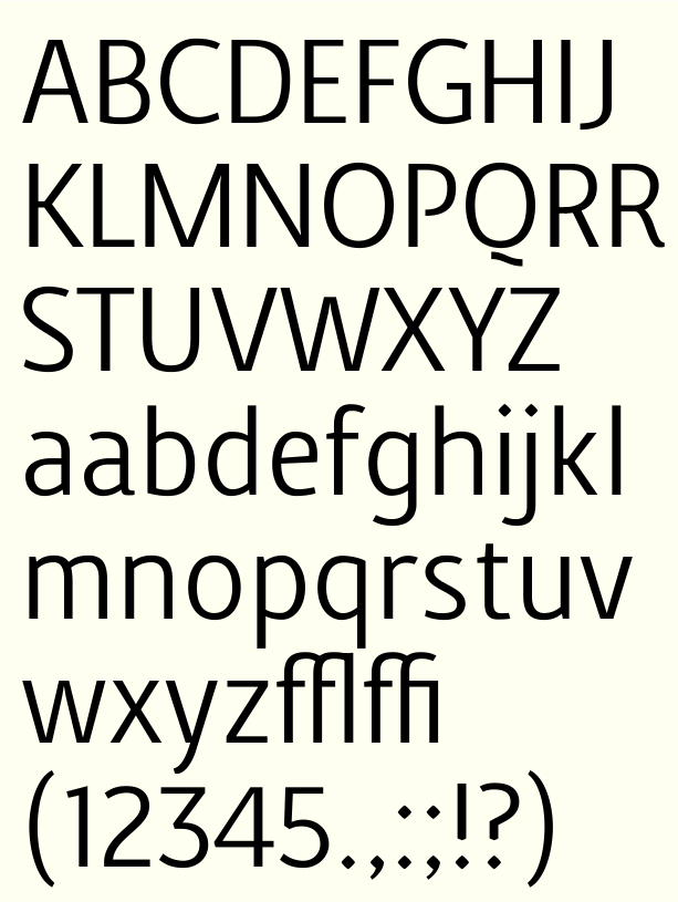
Thanks. It has a bit of contrast, I've tried making this have almost no contrast, but I didn't quite like it. Still struggling my way with the contrast for the figures, where to put the weight and how to balance it, etc.

